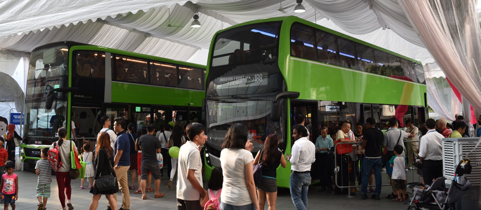
Buses are pretty much the workhorses of our public transportation network. While you hear grumbles of train delays every now and then, or taxi drivers whizzing past you because they have ghost passengers in their cabs while still complaining that UberX and GrabCar drivers are stealing their ricebowls, you seldom hear anything about buses. They just work. In the event of the occassional breakdown, most wouldn’t mind anyway, since you’ll be sent on your way within ten minutes most of the time with a complimentary ticket on hand.
I love buses far more than trains because you get a seat most of the time. If you’re seated inside, there’s no pressure to give up your seat. You can look out the windows and actually see something that’s not just tunnels. You can take a nap, or contemplate the world. I generally find bus rides far less tiring and less stressful than taking the MRT.
Thus, while the LTA is probably busy trying to make the MRT break down less often, it’s still heartening to see that they’re serious about our buses too.
Government Contracting Model
In 2014, the LTA announced that bus services in future would follow a government contracting model, where the government would collect fares, own all the capital assets and determine routes, while the transport operaters simply operates the route. This makes a lot of sense given that our beloved SBS Transit and SMRT Corporation are publicly listed companies heavily focused on the bottomline, whose goals do not usually align to the needs of commuters.
At the same time, the government was keen to let other operators into the market, to keep both incumbents in check. So far, Tower Transit and Go-Ahead have been given the, um, go ahead to operate services in the far corners of Singapore (Jurong West and Loyang respectively).
Green or Red?
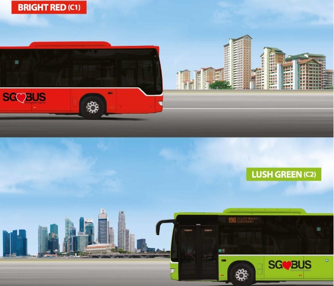
To show that it was now in charge, the LTA launched a contest late last year, asking us to vote for the colour of Singapore’s future buses.
Two choices were given–bright red and lush green. The LTA even painted some buses in their respective colours so we could better visualise them.
While technically we had a ‘choice’, if you’re like me and liked neither, you could only choose between the better of two evils. I chose bright red, because honestly, the lush green, though unqiue, looked like crap to me (which is why it probably remains unique).
Then again, I get why people would choose lush green (which won out in the end by just 144 votes, a smaller percentage victory than Sitoh Yih Pin’s win over Lina Chiam in the 2011 general elections). Bright red is already in use in London’s iconic buses, and we hate to be copycats.
What I would have loved is a royal blue/yellow colour scheme, like you see on Singapore Airlines. Elegant, yet understated.
But lush green it is. The public has decided, and the government seems intent to follow it through.
One thing of note before we continue: Is the government ever going to conduct such a contest for the Downtown Line trains? The paintjob for the Downtown Line trains looks kinda unfinished right now.
New Bus Concepts on Display
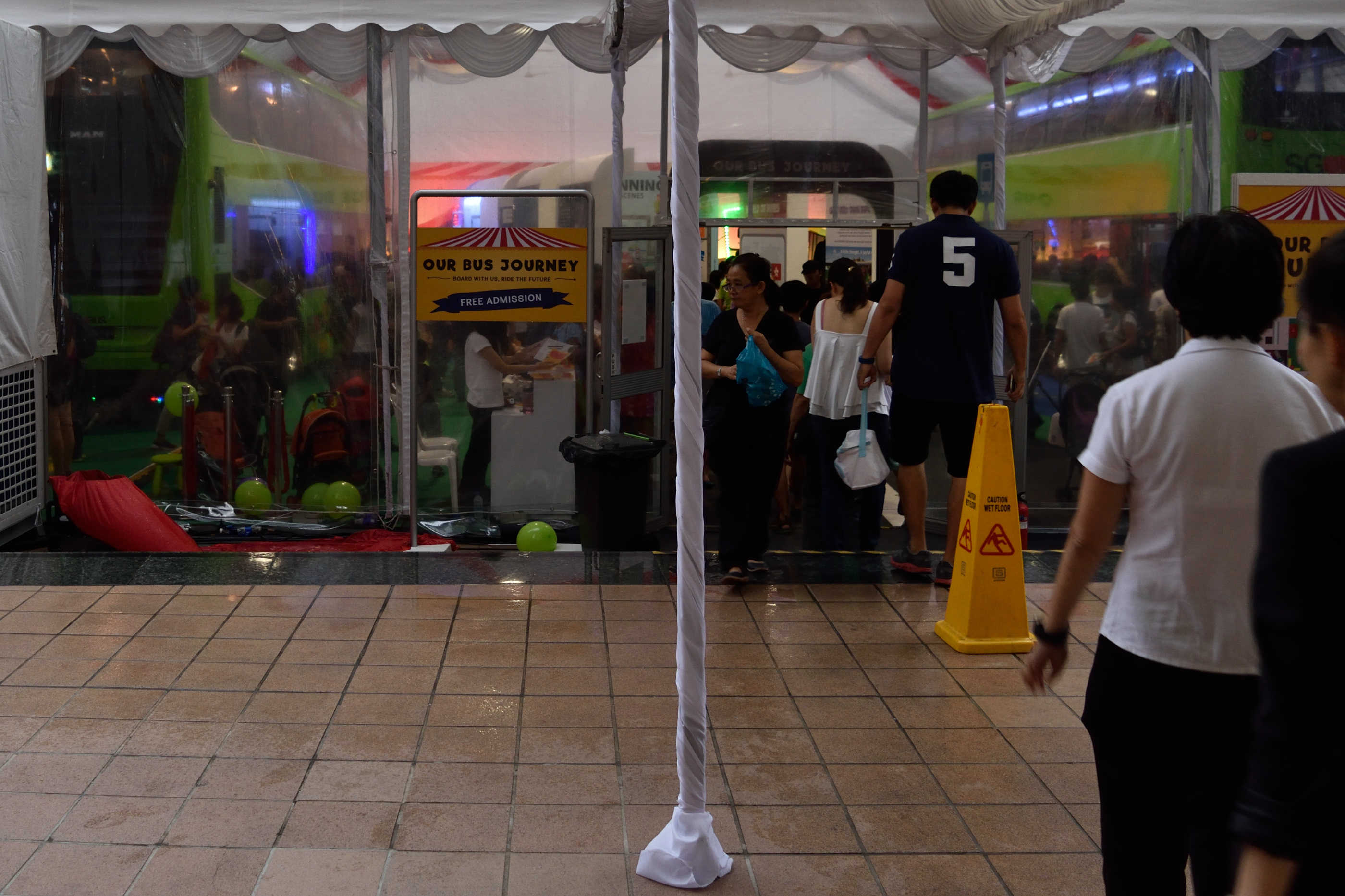
With colour out of the way, one might wonder if the new model would yield any tangible benefits, or would it be just a failed experiment. As it turns out, the government is going all out to make sure that it doesn’t become a failure. To convince you further, the LTA is conducting a series of “Our Bus Journey” carnivals over three selected weekends in March and April 2016.
Being the closet bus otaku that I am, I checked out the first of the carnivals at Ngee Ann City over the weekend. There was a sizeable crowd of varying demographics–turns out there are many more such people around 😉
Two new concept designs for double-decker buses were presented, and they had actual buses for you to sit in. One was based on a MAN Lion City, while the other based on an Alexander Dennis Enviro500.
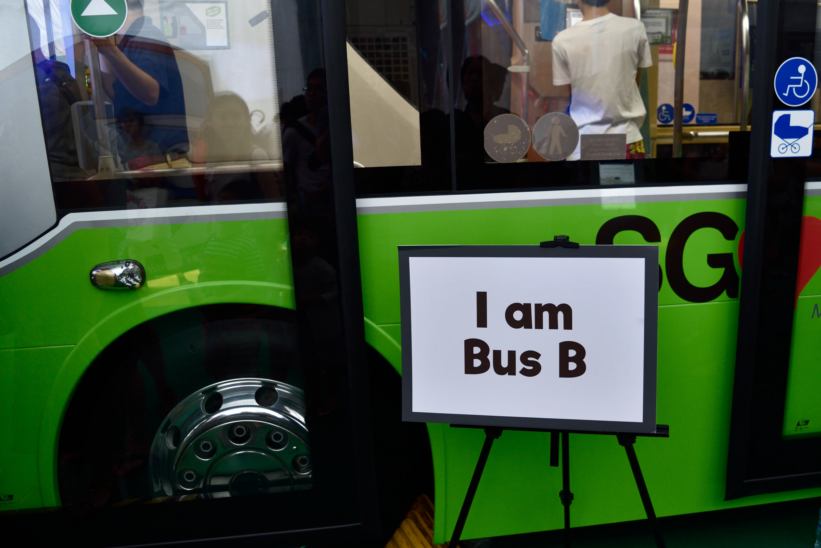
There were interactive survey kiosks outside each bus for you to state what you like or didn’t like about the concepts, and those votes may influence the final interior design of these buses.
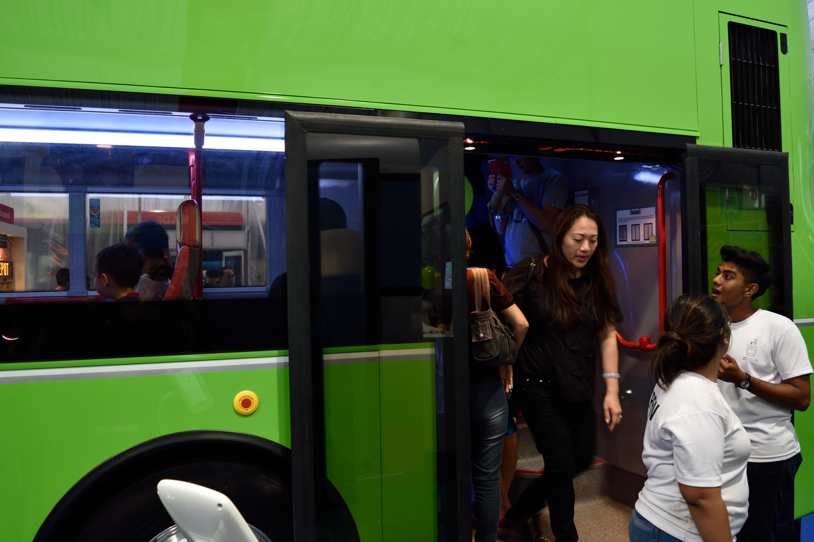
Bus A features the unique rear third door design that’s been covered heavily in the media. Basically, this bus has two stairways–one near the front door where it always has been, and another at the back as pictured above. Hopefully this would reduce the conflict between commuters trying to go up and go down the stairs at the same time.
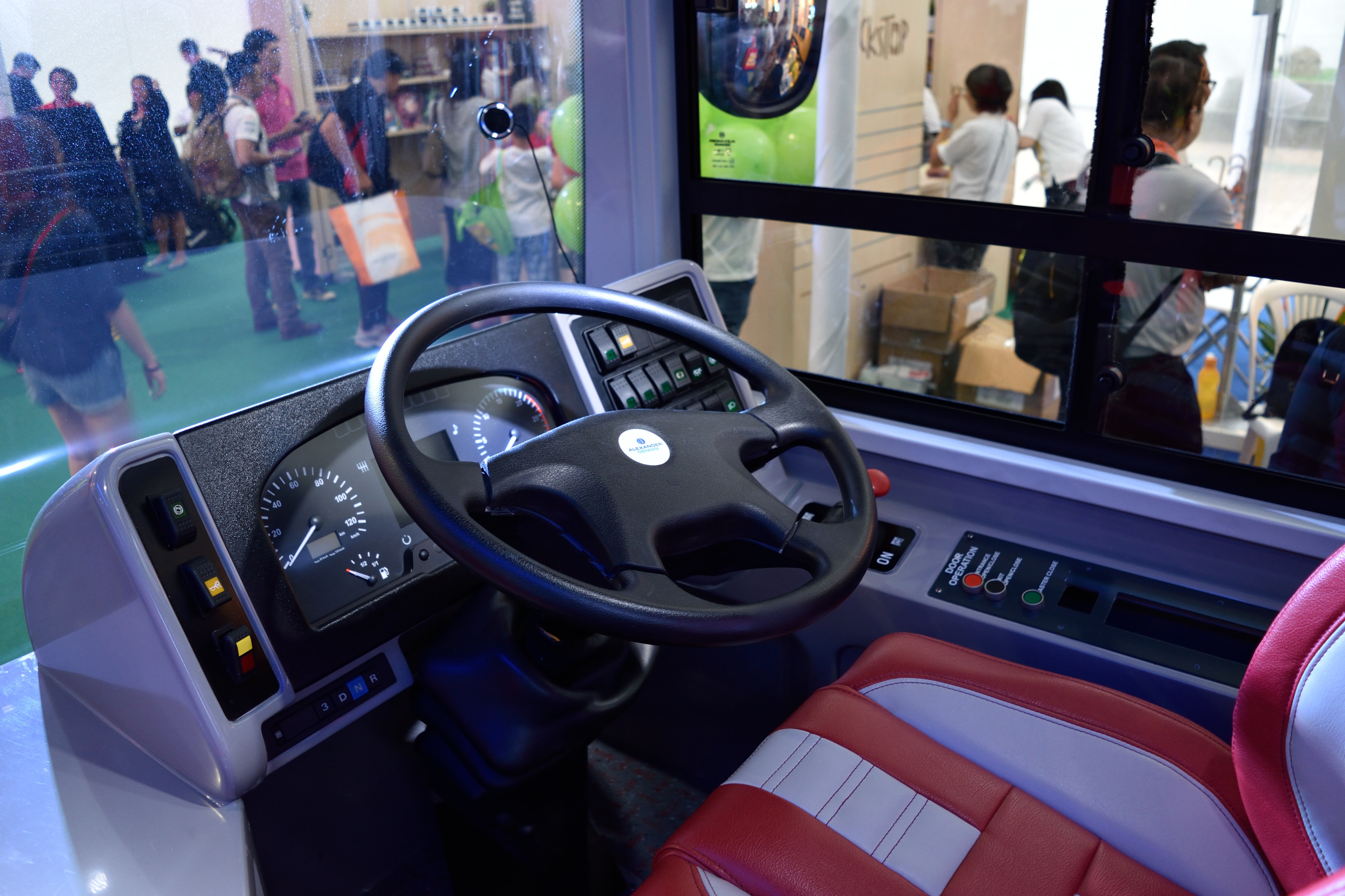
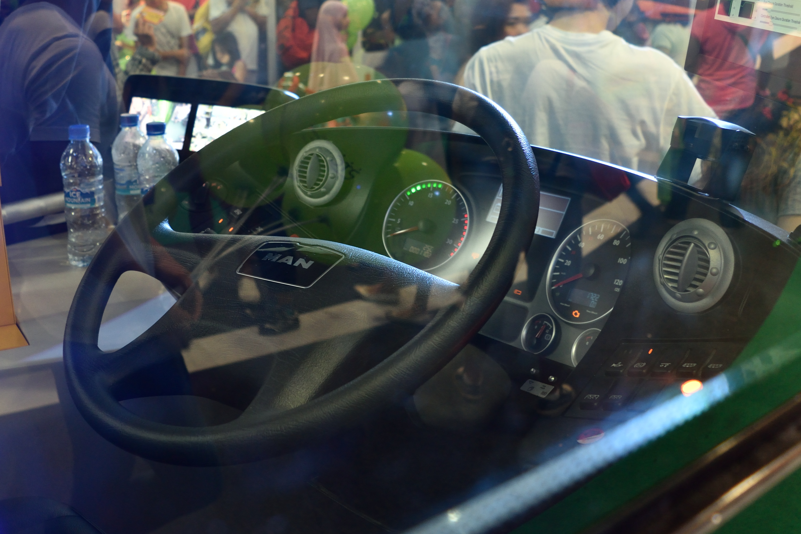
On to the interior of Bus A. The dashboard looks pretty spartan; I guess most of the instruments and gauges would be placed within the LCD information panel. Curiously, there’s a gear shift symbol on the dashboard even though our public buses have been automatic transmission only for decades now.
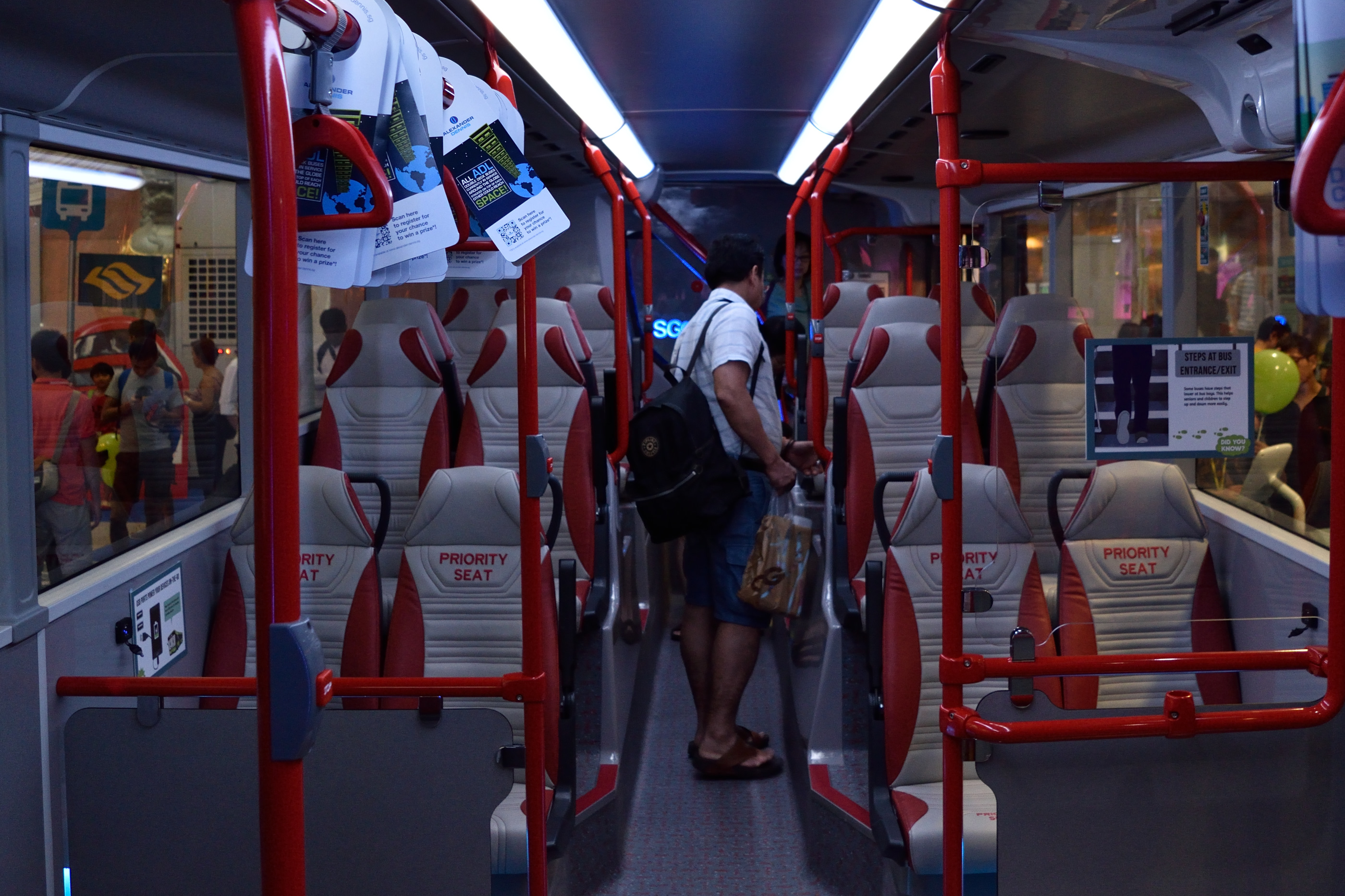
The colour scheme and design of the seats look rather tacky, especially the “Priority Seat” wording. If you can overlook that, the seats look really comfortable (I didn’t sit on them long enough to be able to comment). For once, we have high back rests, which would make long bus journeys more enjoyable (or tolerable, depending on your fondness for buses). Hopefully this would also mean less oily windows since people no longer need to lay their heads on the window to catch a nap.
If you look carefully, you will also notice that there are hand rests on the outer seats.
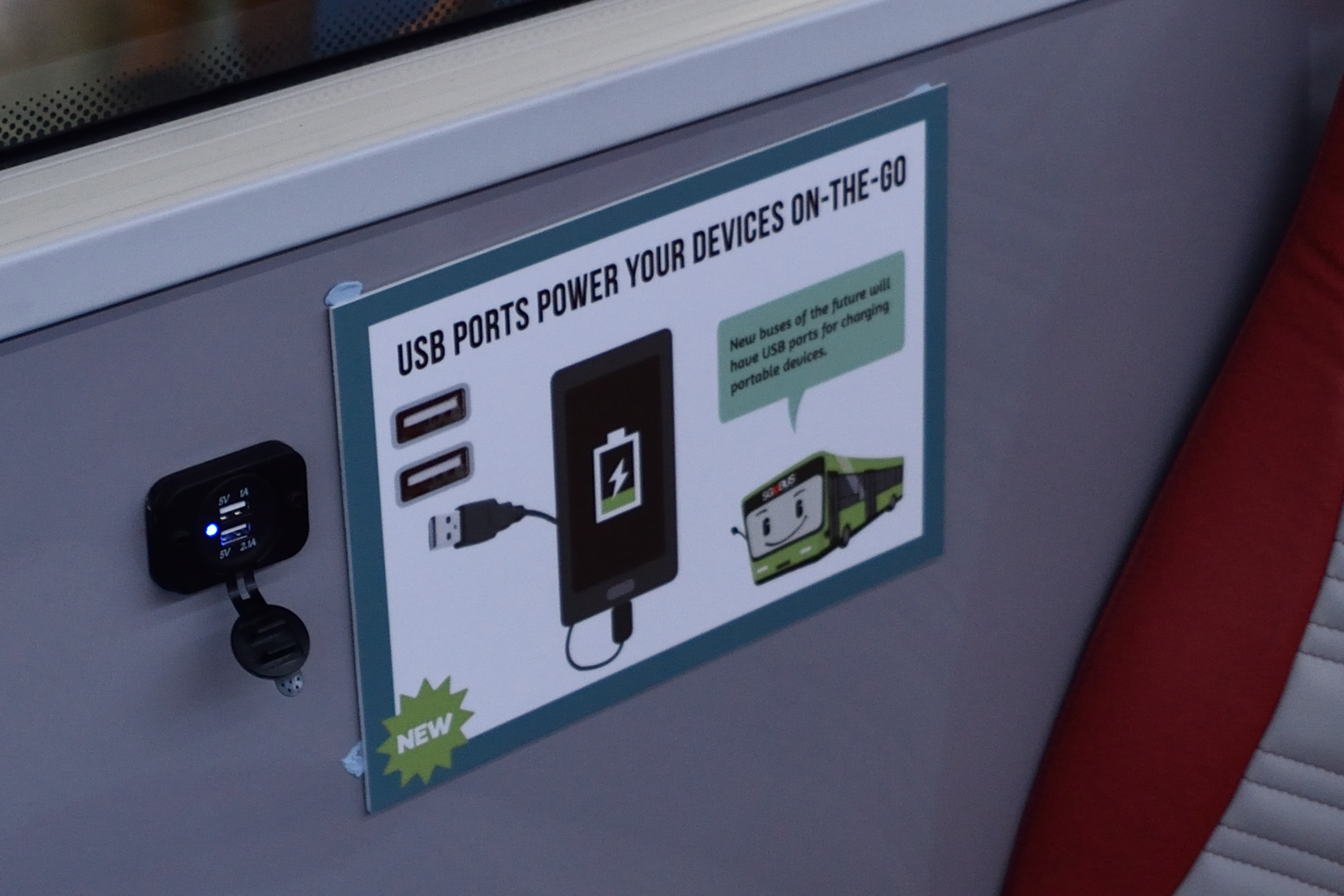
And of course, the USB ports. I have no idea how this will hold up in actual use–I think after a few years these USB ports would either become faulty or obsolete. Buses in Singapore have a service lifespan of about 17 years; USB might be irrelevant by the time 2033 arrives. Hopefully there’s an easy way for LTA to swap in replacements as and when they are needed.
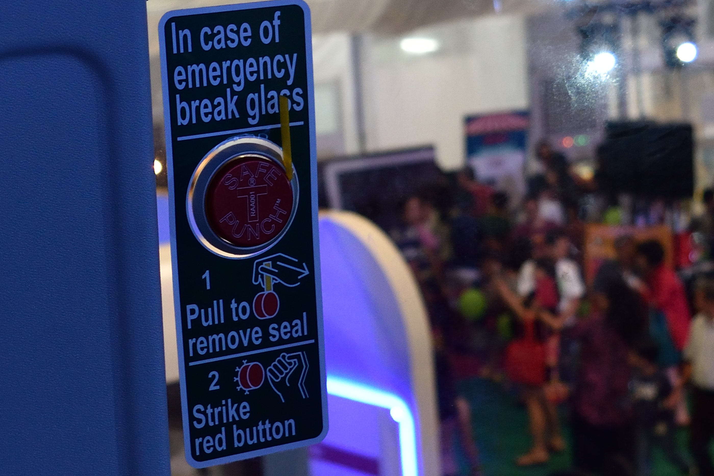
The emergency hammers used to break the windows on the upper deck have also been replaced with a big red button. Surely, it feels far less daunting to mash a big fat button than to use a hammer to break something, even if the end result is the same.
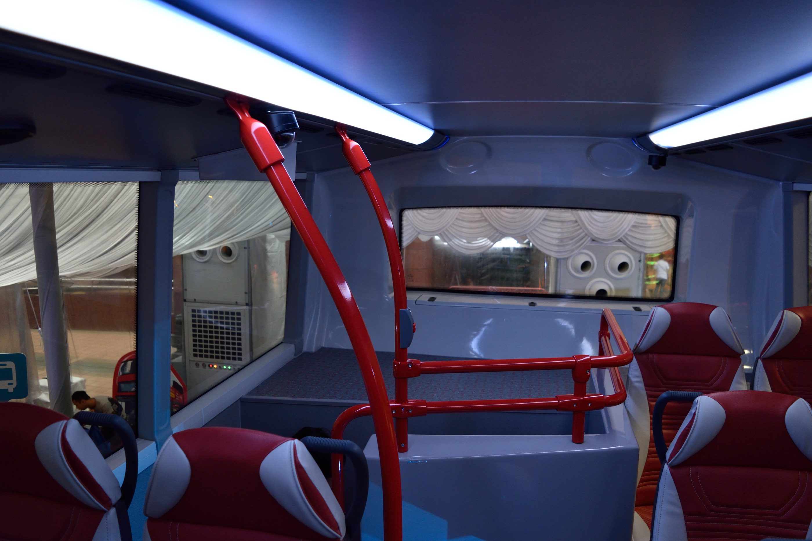
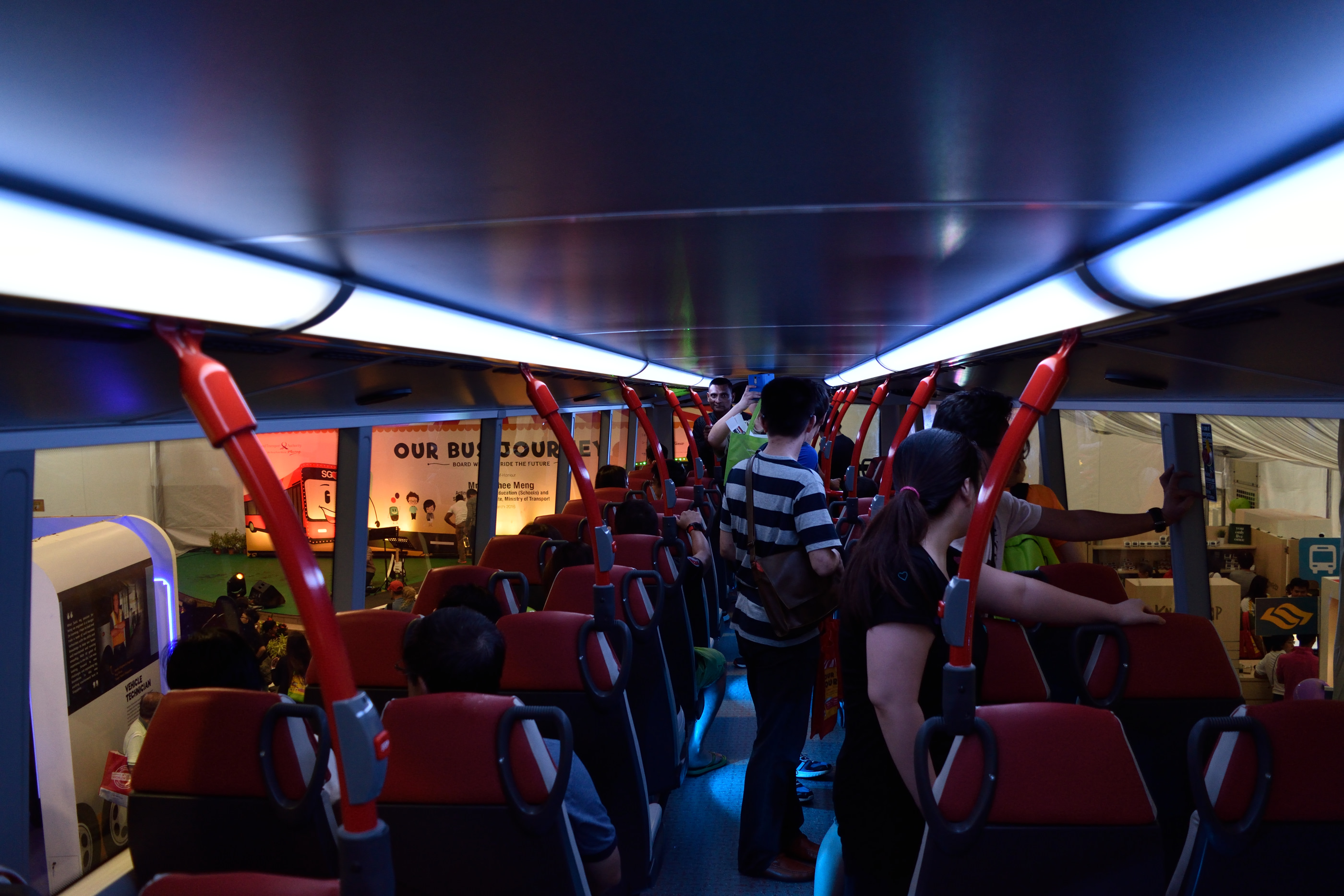
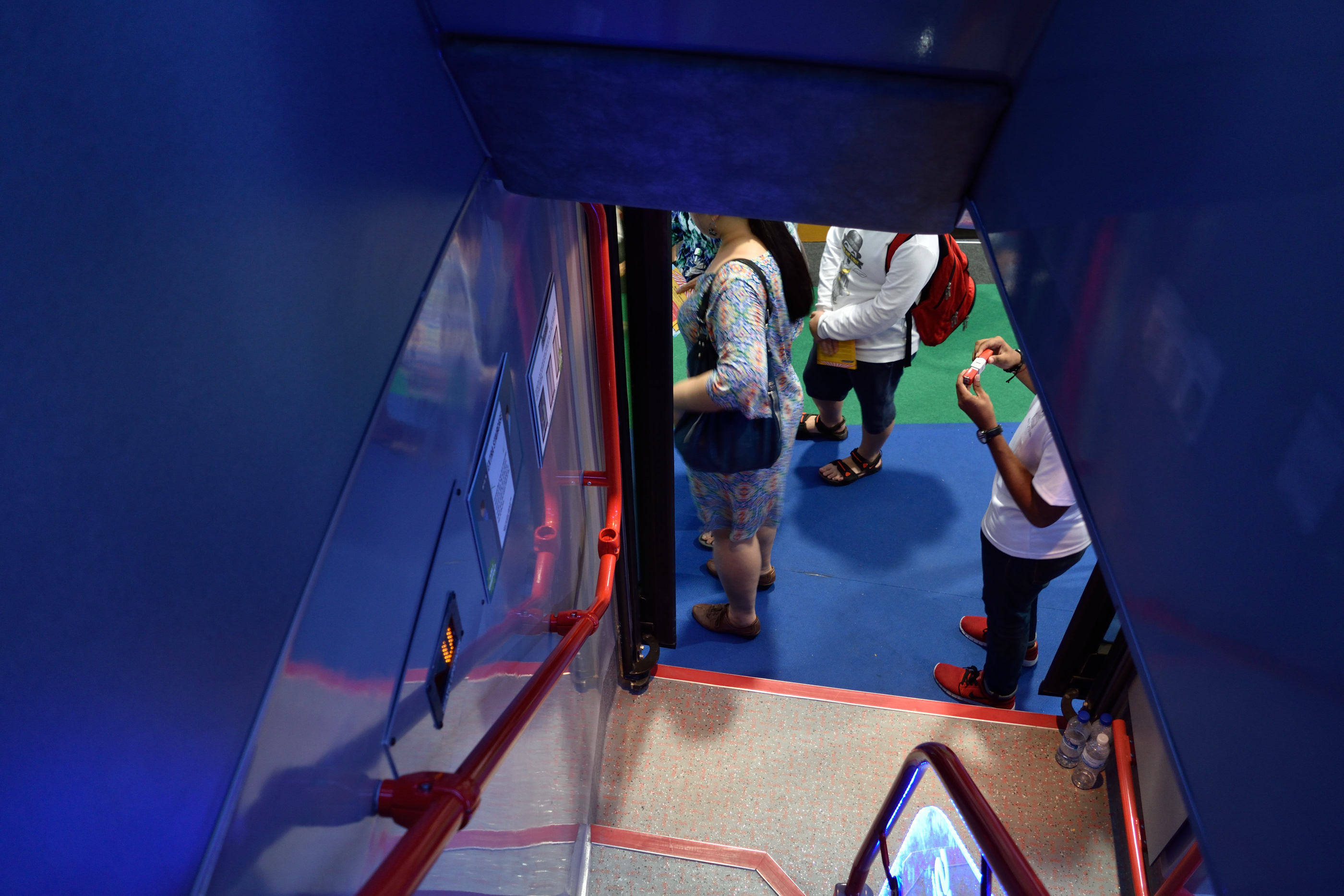
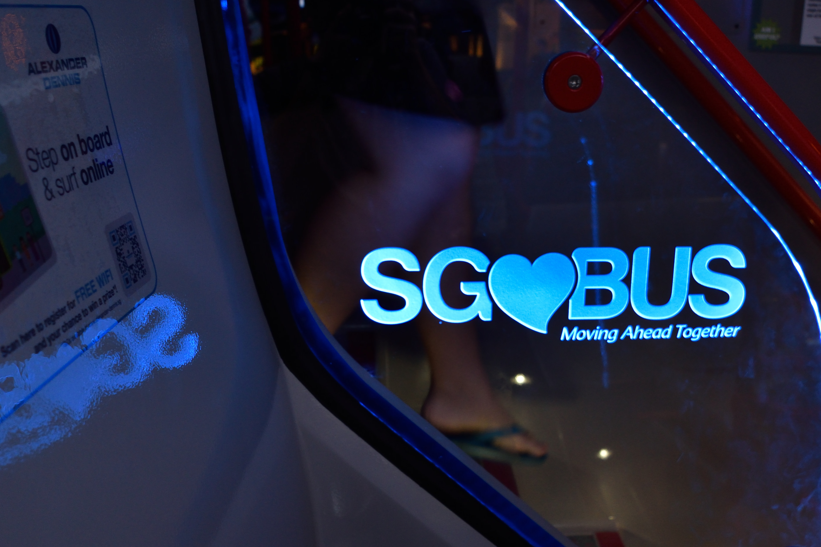
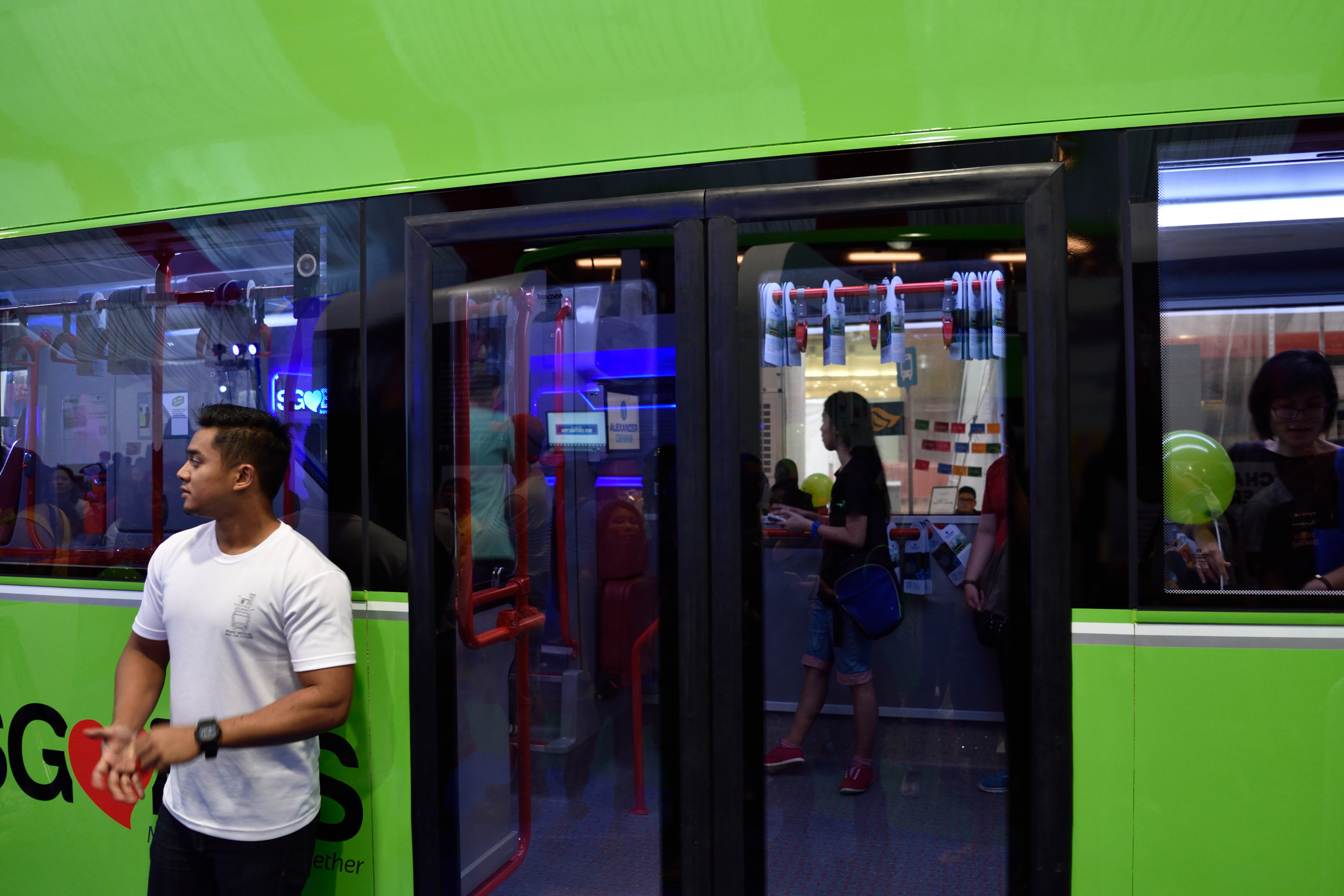
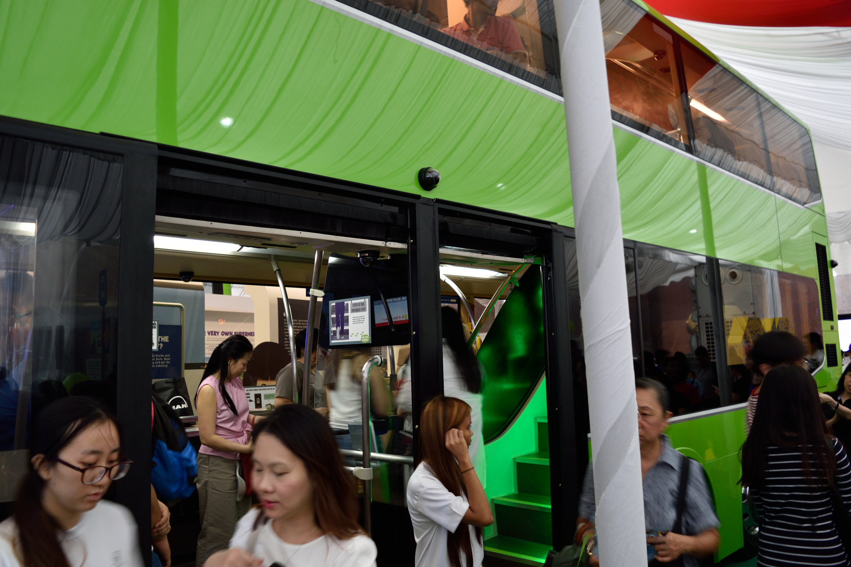
What about Bus B? Bus B has three doors as well, but the third door is right next to the middle door. I guess this makes quite a lot of sense because if it rains, the bus shelter may be too small to shelter all three doors at the same time if you have a design like Bus A.
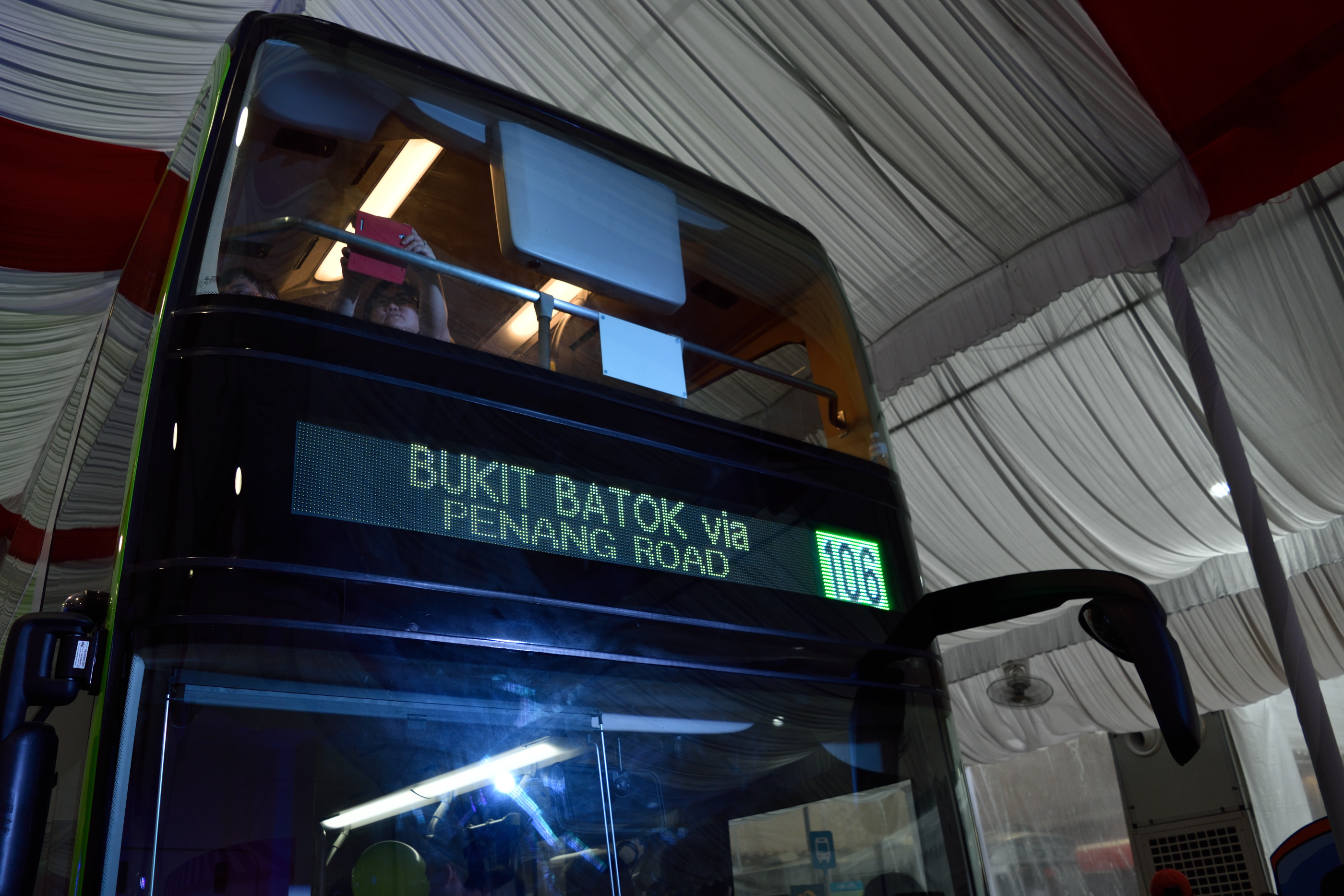
Bus B (I’m not sure about Bus A; it might be the same) has a new destination board design as well. It’s green and appears to be higher in contrast as compared to existing boards, though the number is smaller. I would love to see bigger boards though that perform well in direct sunlight, especially with an ageing population.
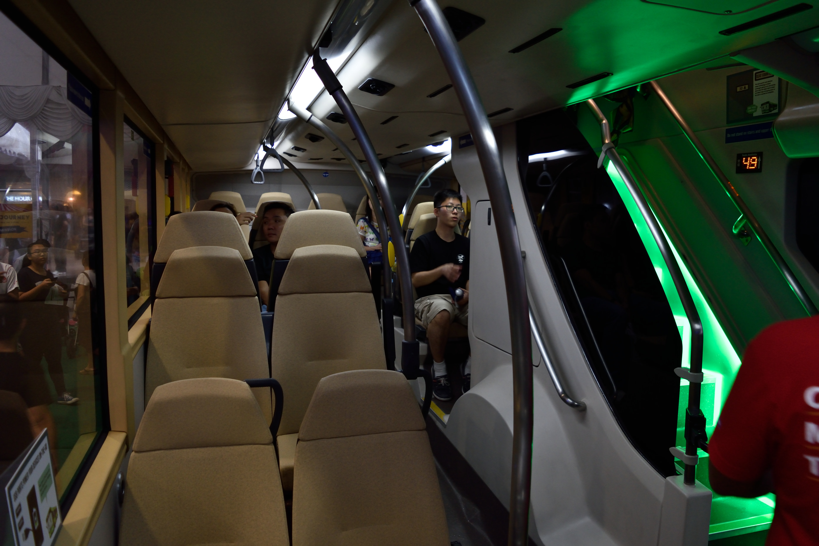
Moving on to the interior of Bus B, the seats look far more elegant than that of Bus A. The staircase has nice ambient lighting to it, but it blocks a large part of the left side of the bus. If you sit right behind the staircase you probably won’t know what’s going on at the front of the bus too.
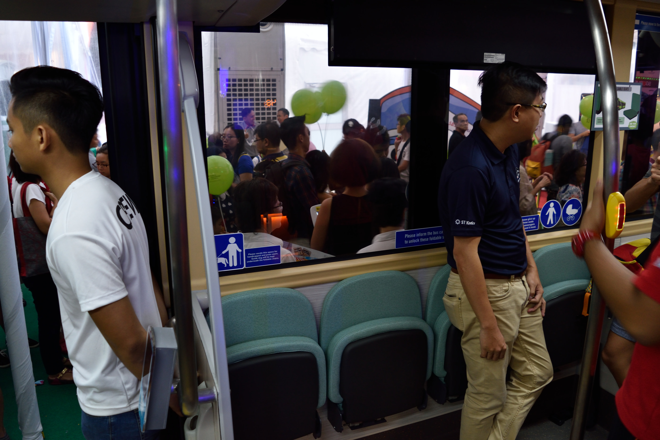
The priority seats fold up and don’t look very comfortable. While it means more space during peak hours, I think this is still a bad design. I would definitely not sit on one of these seats–there’s a fear within me that I’ll be surrounded by people standing all around me.
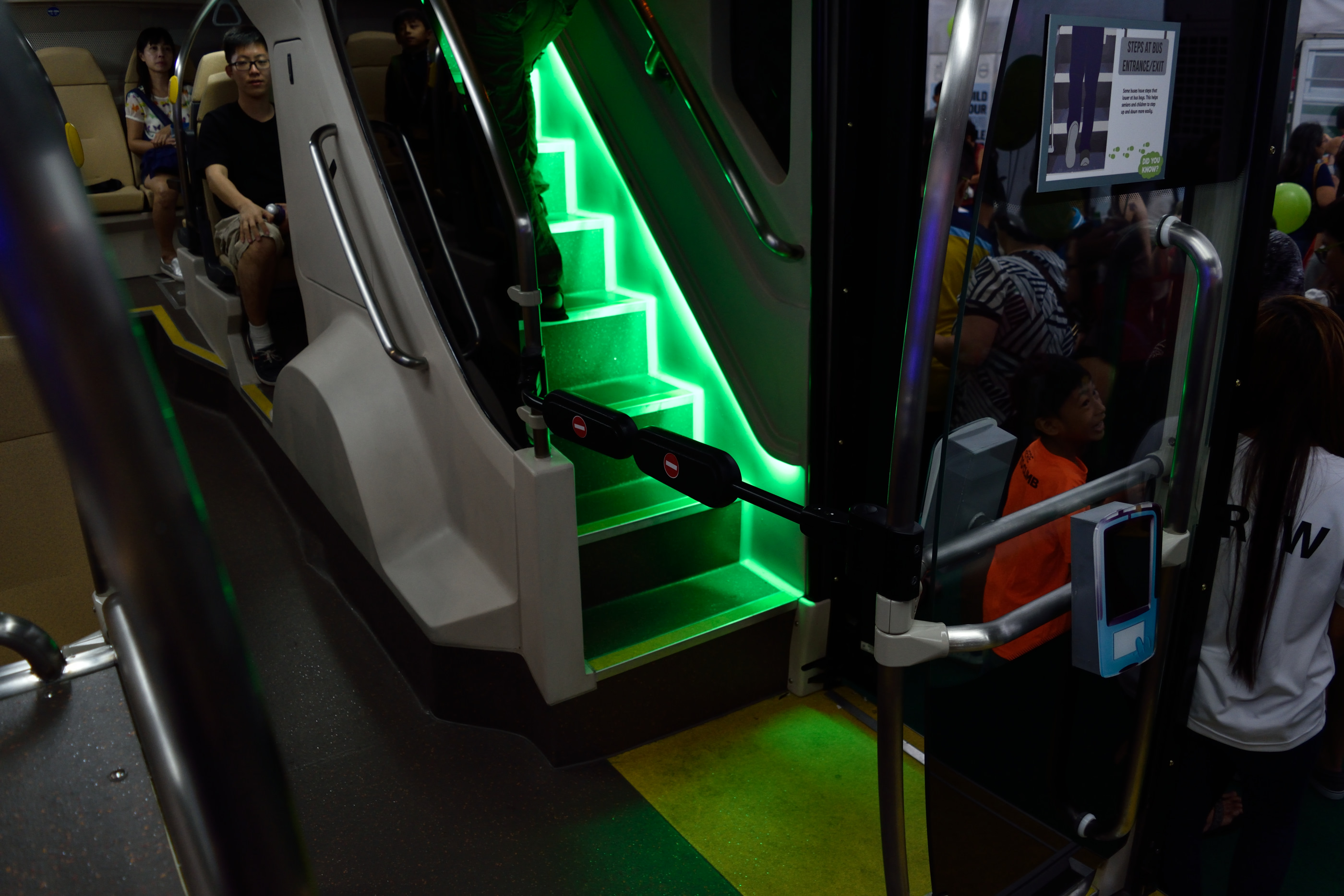
If you’ve been wondering what’s the point of a third door that’s right next to the middle door, the above image should answer your question. The rear staircase and third door is strictly for exit only, and you won’t have people blocking the area because it is cordoned off from the rest of the bus. Neat.
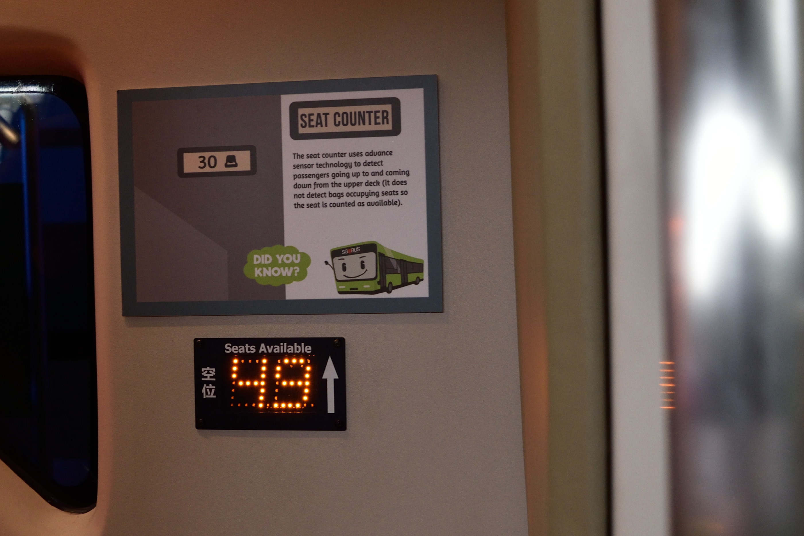
I’m puzzled by the detailed explanation of this seat counter situated at the stairs, since it has already been available in current buses for many years now. I’m also not sure if the sensor is at the bottom and top of the stairs (as it is currently) or on the seats themselves–the wording seems to suggest both.
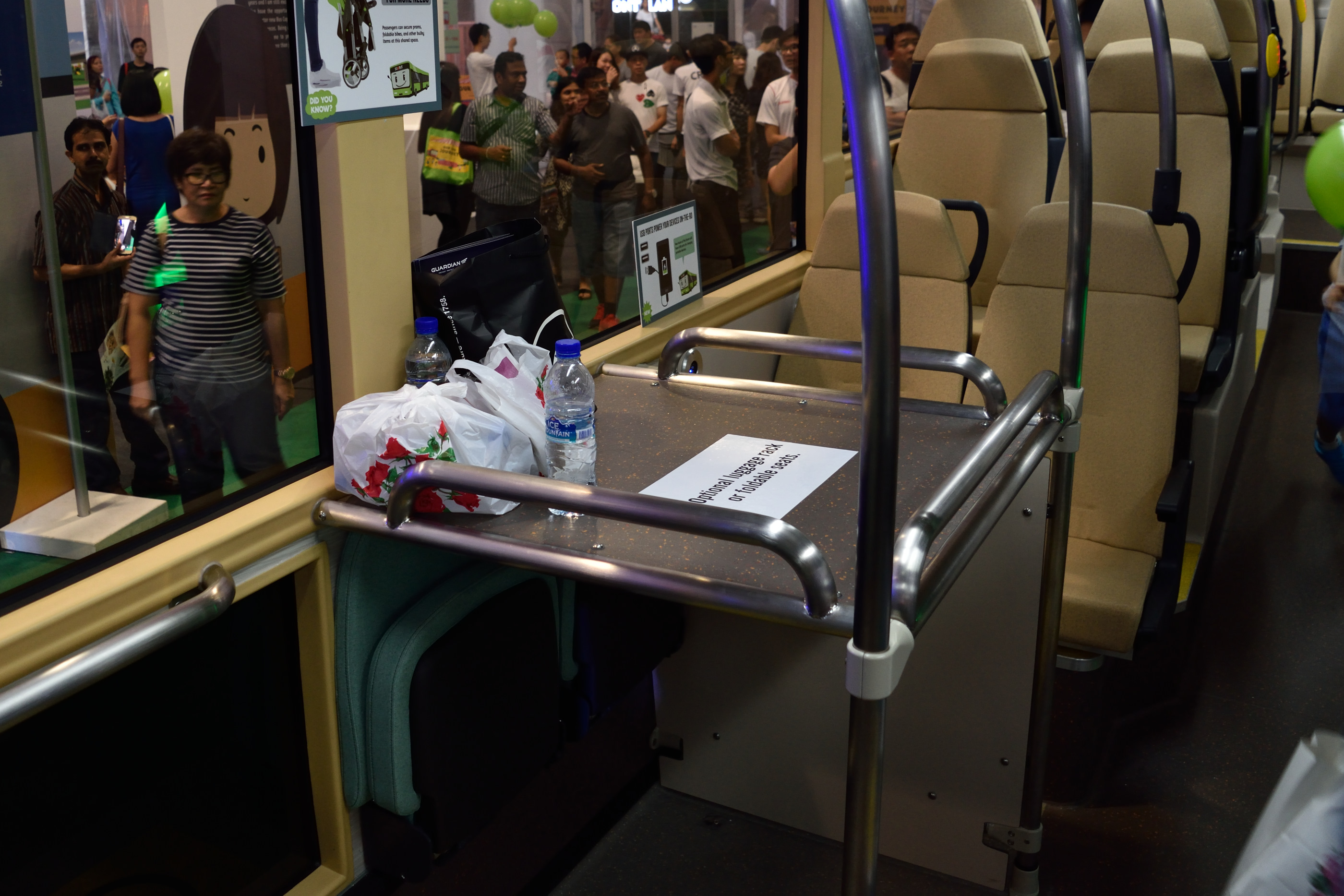
At the lower deck also sits an optional luggage rack, which I think is a waste of space in the Singapore context. The current ‘luggage racks’ where people put their stuff on top of the wheel covers work just fine.
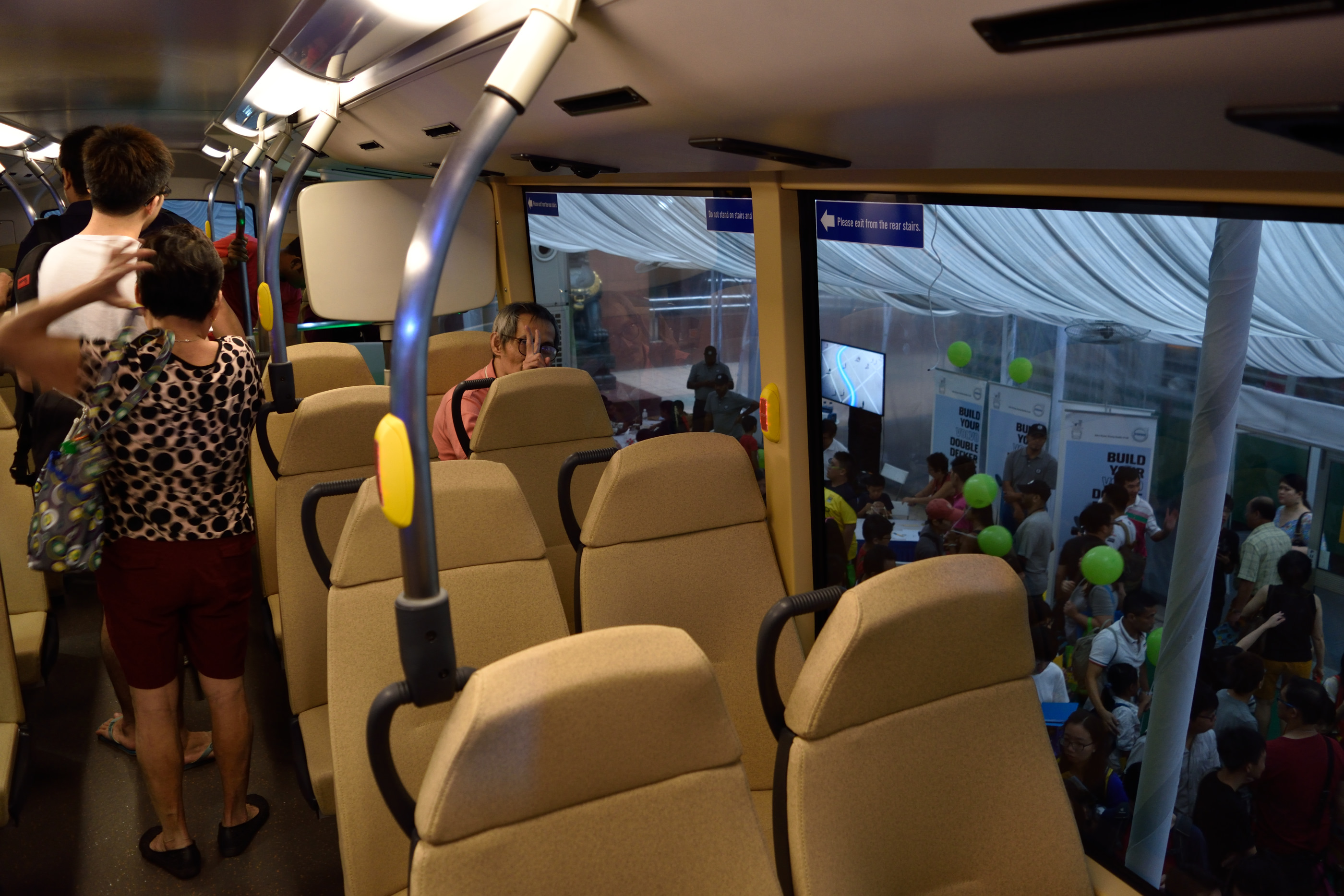
Moving up, the upper deck has a familiar layout, but a really nice colour scheme. The colour of the seats blend in well with the lighting and all.
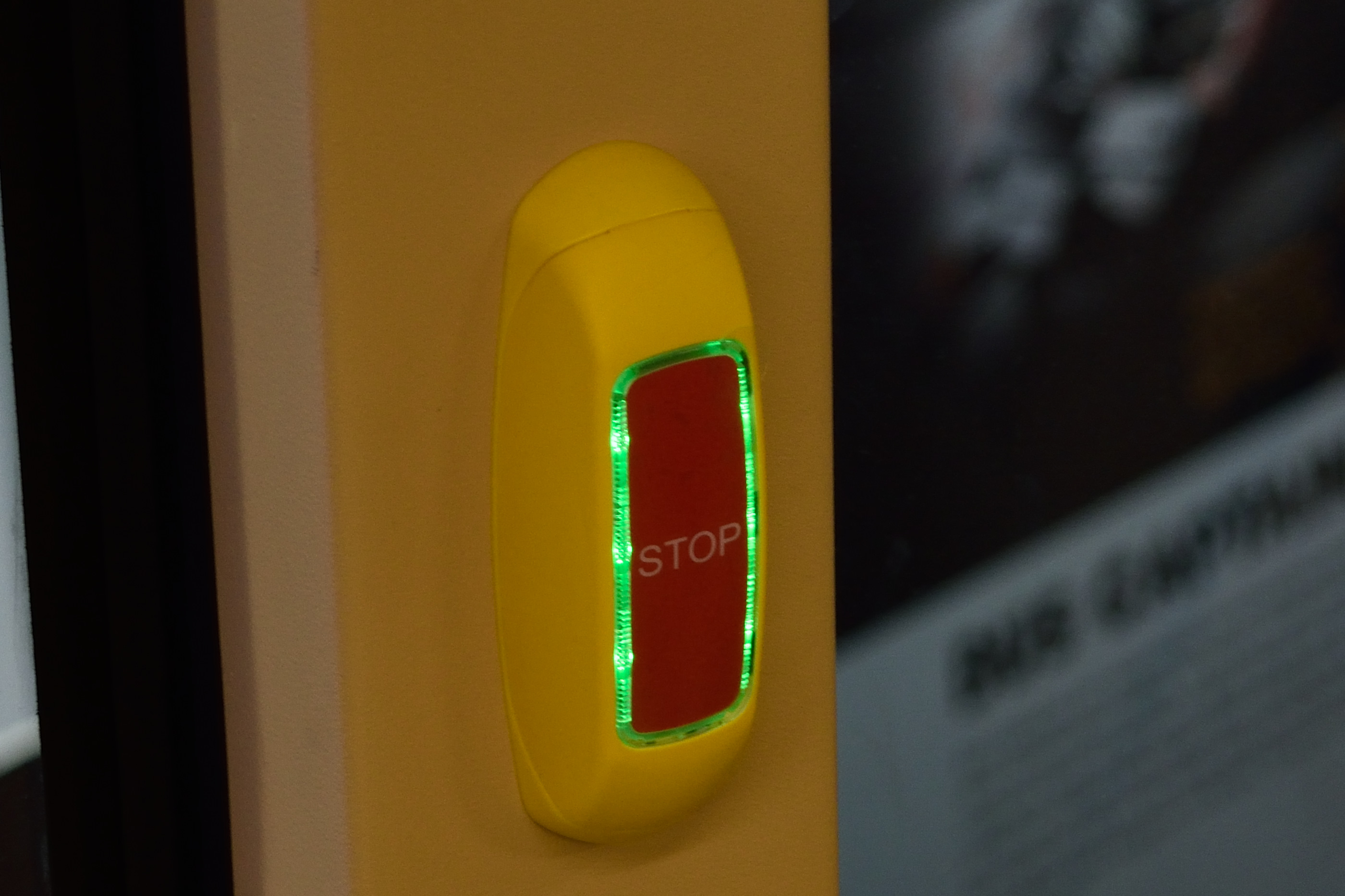
Meanwhile, there’s also a new “stop” button on Bus B. For some reason, it’s a touch button rather than an actual button, and gives no tactile feedback when pressed. I’m assuming the light surrounding the button indicates whether the stop button has been pressed or not, rathe than just showing everyone where the stop button is.
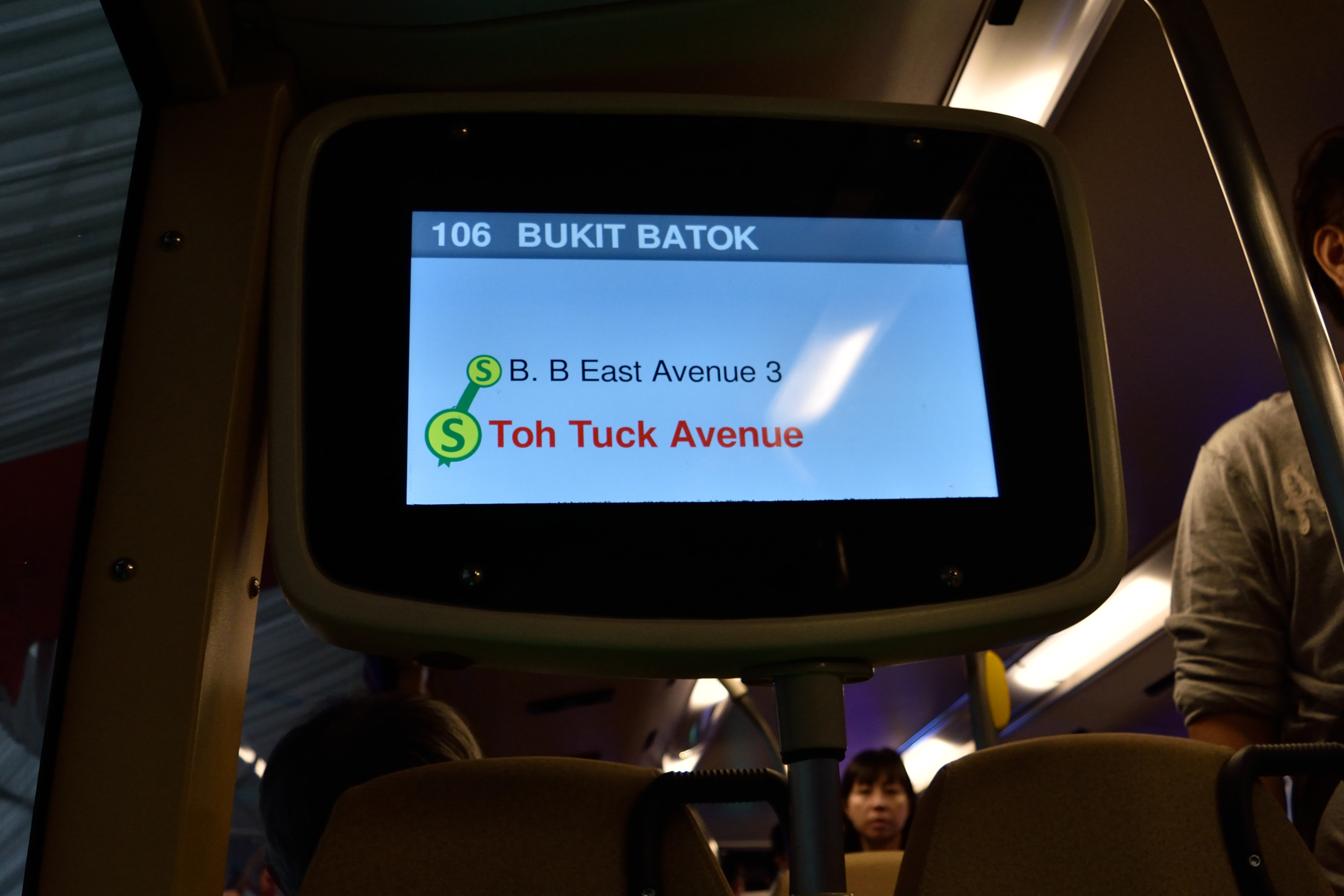
There’s now also a screen that shows you the current bus route. Immensely useful, as long as it works correctly. And now you wonder why they even removed the TV Mobile screens in the first place once the service was discontinued–they could’ve implemented this much earlier!
Nostalgia
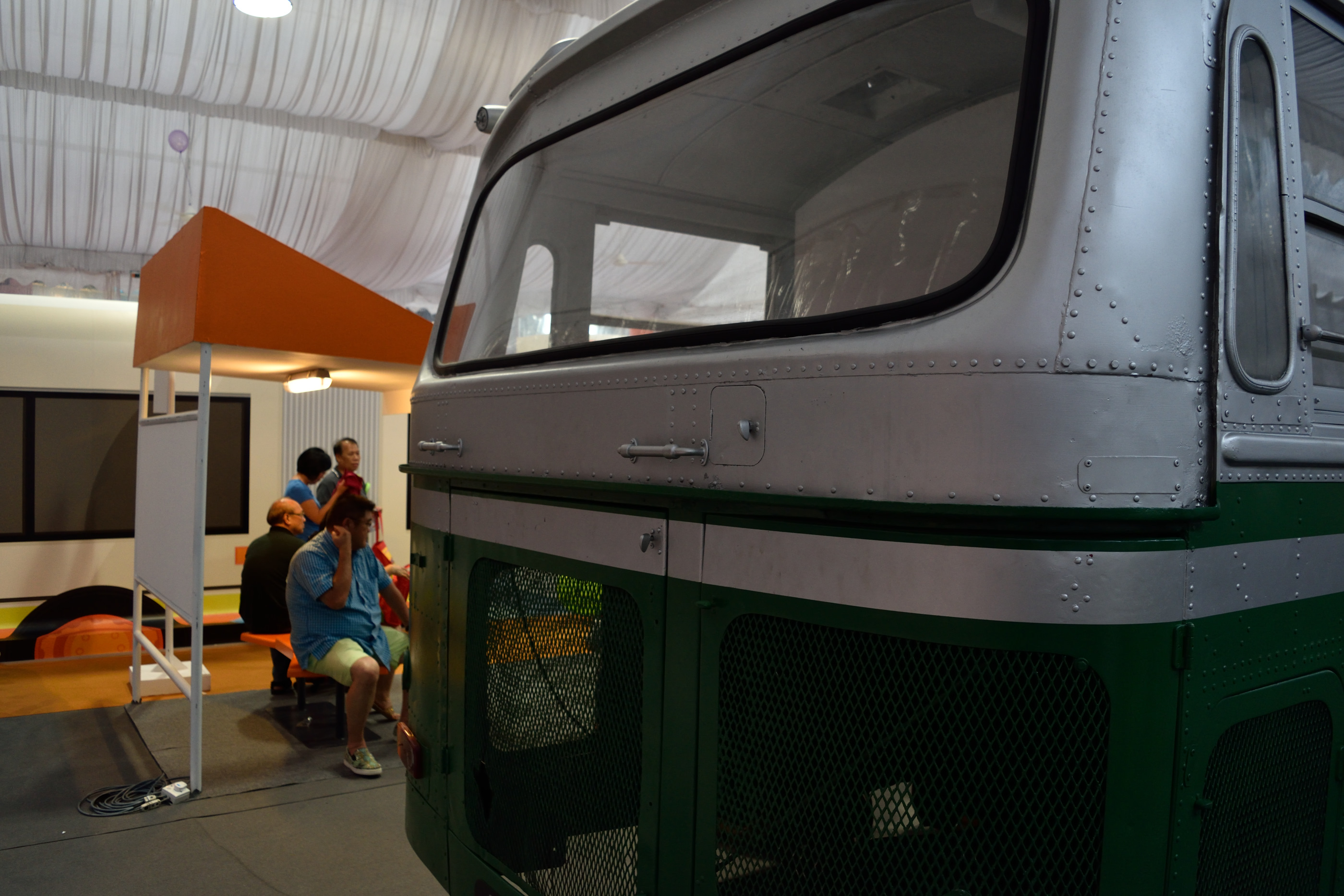
So, that’s about it for the new concept buses. If you walk to the other end of the exhibition, there was also an old Nissan public bus on display. The engine seems to have been removed, but the chassis is still intact. The “STC” licence plate suggests that it was once operated by the now defunct Singapore Traction Company.
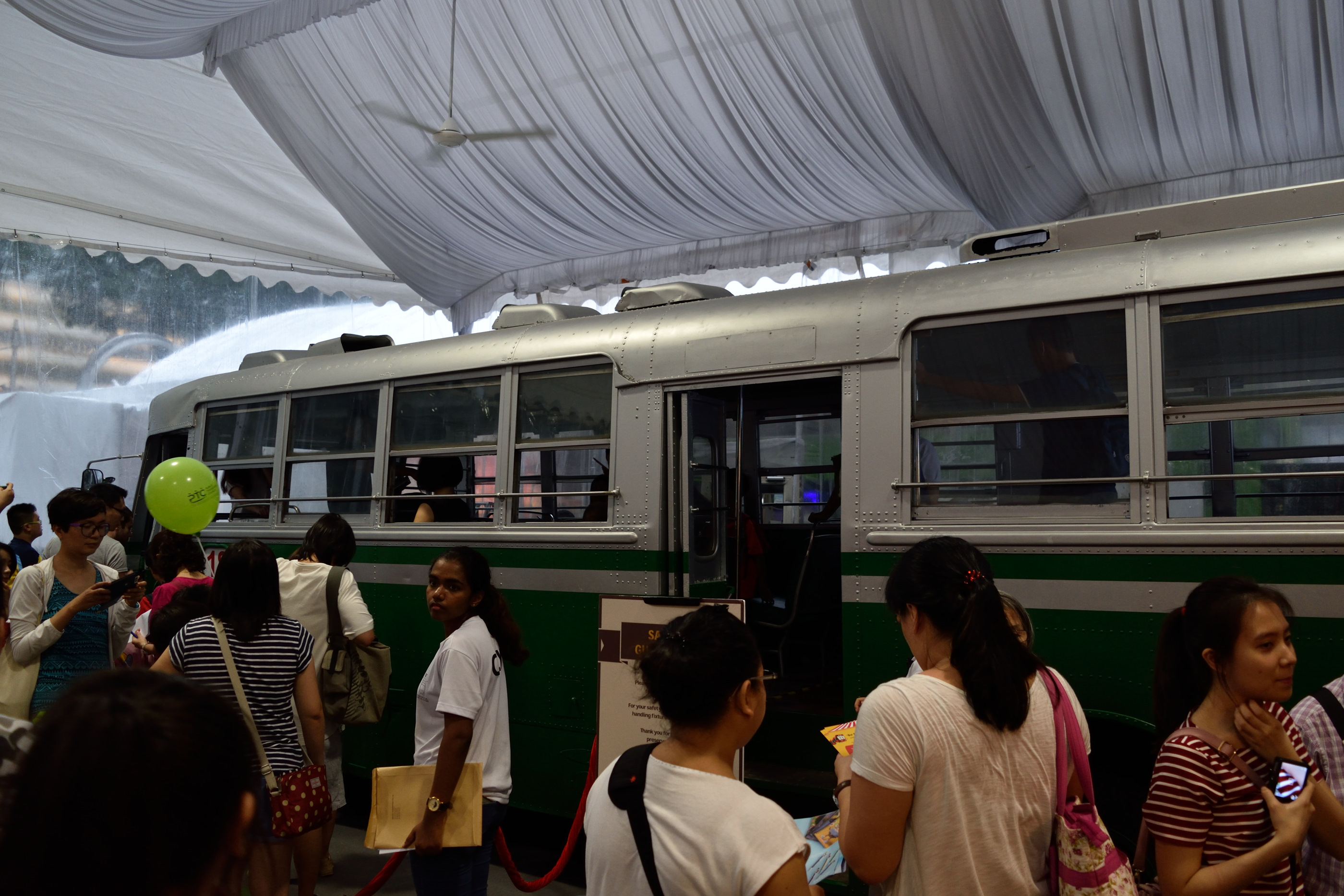
In a way, this bus doesn’t look very much different from SMRT’s Nissan U31 buses which plied the roads up till just a few years ago.
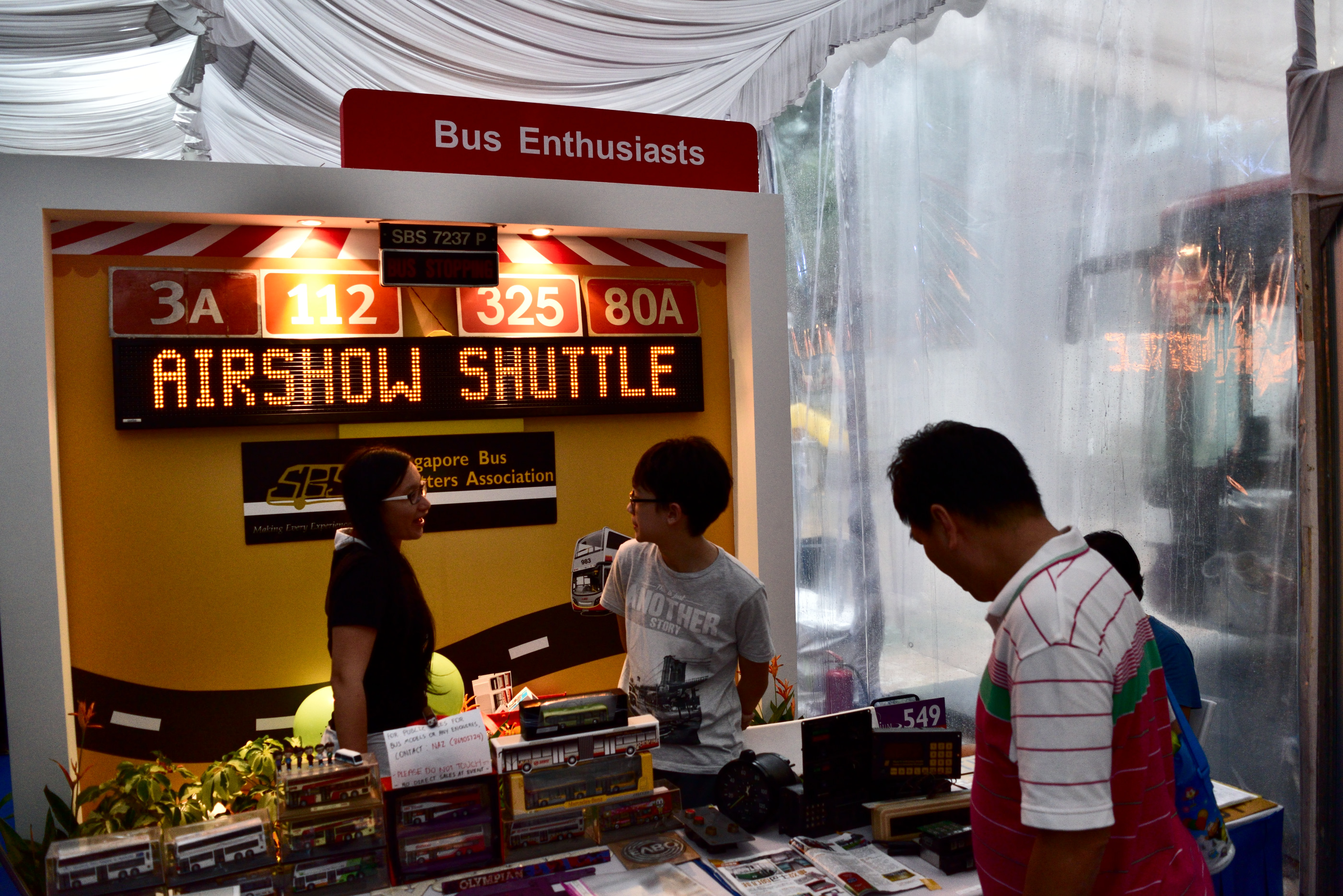
Near the exit was a booth where the Singapore Bus Spotters Association set up a booth showing off their wares, including old destination signs licence plates, probably taken from buses that were about to be scrapped.
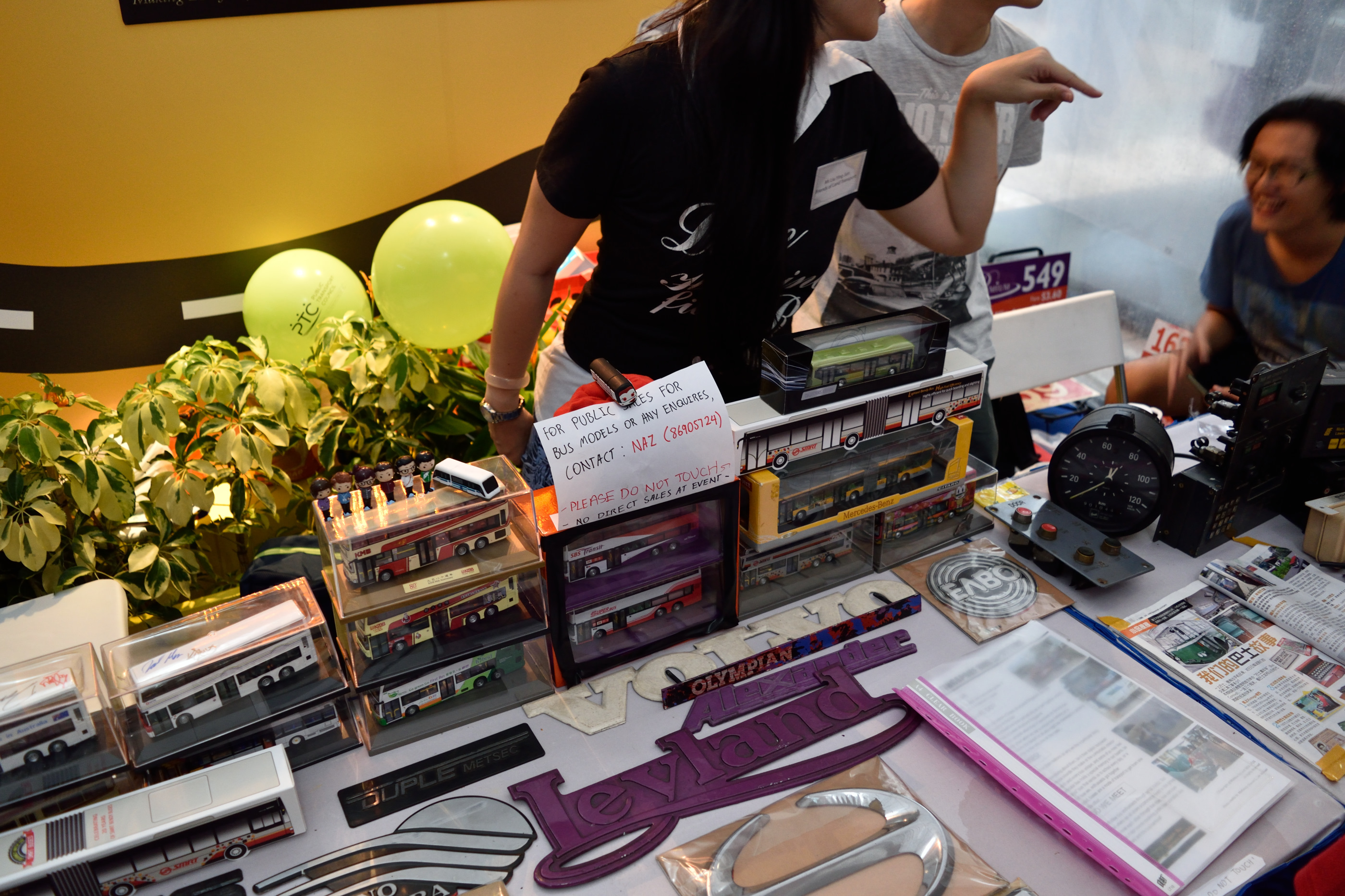
They’re also selling bus models, insignias and other paraphernalia, though those weren’t being sold directly at the exhibition.
Closing Thoughts
The bus carnival was one of the more interesting exhibitions I’ve been to in recent times. It’s cool having a first-hand look at what’s to come in Singapore public buses, especially when, as Donald Trump would have put it, it will be very, very great.
If you’ve missed the bus carnival at Ngee Ann City, there are still two more coming up, at VivoCity’s outdoor plaza from 25 to 27 March 2016, and another at the HDB Hub in Toa Payoh from 1 to 3 April 2016.

