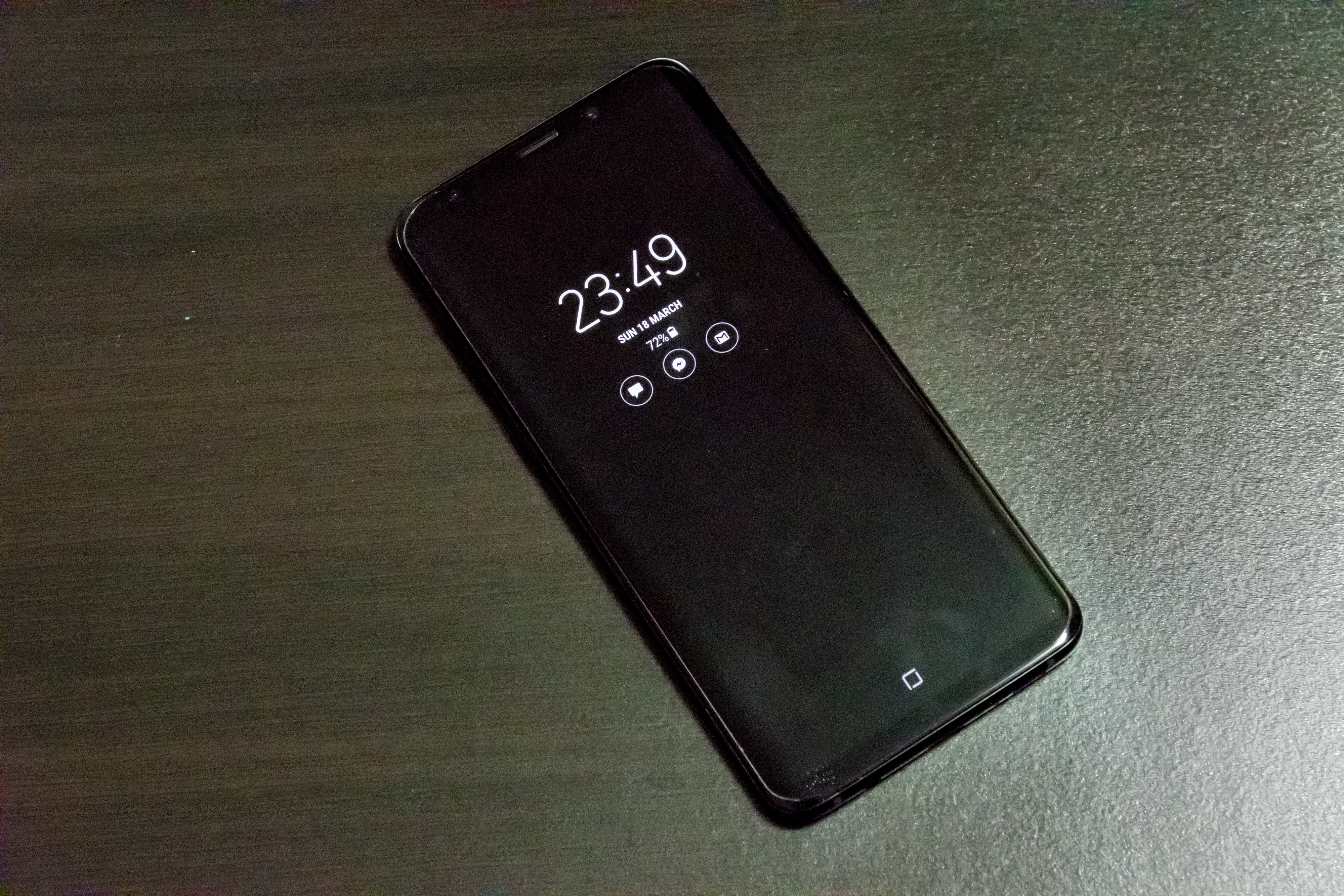
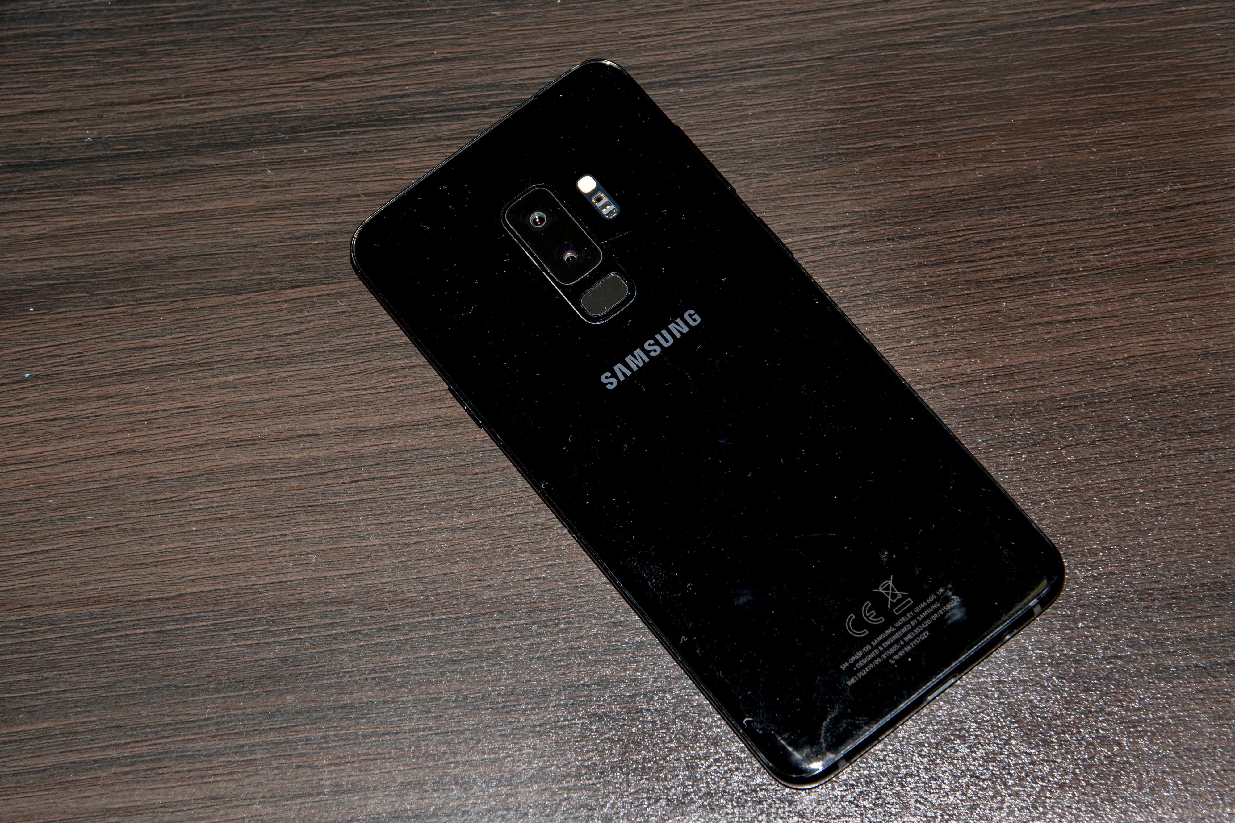
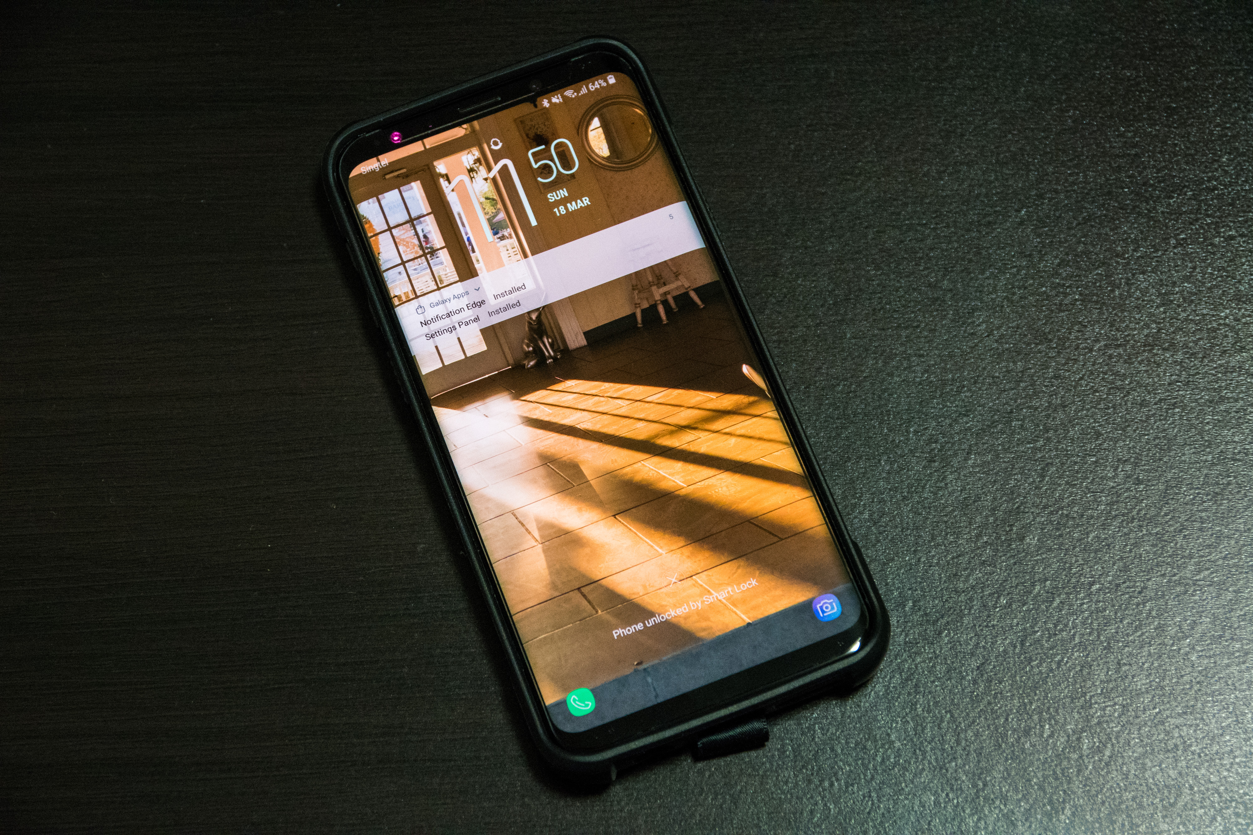
The Galaxy S9 family is perhaps Samsung’s most unremarkable flagship, looking all but identical to its predecessors from the front. Yet, in a time where manufacturers are all too eager to bring their phones up a literal notch, this may not be a bad thing.
Samsung’s Galaxy S series has come a long way. From a tiny 4-inch offering eight years ago to the 6.2-inch behemoth we have today, Samsung has firmly established itself as the king of the Android world and prime competitor to Apple’s iPhone. Prices have also reflected that reality, with the flagship Galaxy S9+ 256GB retailing for a whopping $1,498 without contract, making it the second most expensive phone ever (after the iPhone X).
I pre-ordered the 256GB version of the phone which I collected on launch day itself, as a replacement to my previous S7 edge.
Design
Samsung seemed to get almost everything right with the design of the Galaxy S8/S8+. It was understated yet iconic–despite the lack of a logo on the front, one could definitely make out that it was an S8/S8+. It was also a refreshing change-up back in a time where companies (including Apple) were still content slapping seemingly useless horizontal bezels on their phones.
Perhaps the one thing that needed fixing was the placement of the fingerprint sensor, which Samsung has rectified this time. One can’t help but wonder if it was a deliberate move on their part previously so that they would have something obvious to fix for this iteration.
While almost everyone else is busy copying the notched design of the iPhone X (or arguably, the Essential Phone), Samsung has decided to look the other way for once. In its place, we have what the S8/S8+ should have been looks wise.
Meanwhile, from the front, the S9 family is indistinguishable from the S8, unless you hold both iterations side by side. The display is still curved at the corners and slopes down gently towards the side, the latter of which is the very essence of Samsung’s design identity today. In practical use, though, I would love to see that edge screen gone, because it is often an expensive exercise in frustration getting a tempered glass screen protector to work properly on these screens (more on that later). I don’t care much for the curved corners, too. Curved corners belong to a bygone era and should remain there. My last display with curved corners was a 14″ Samsung CRT television.
On the other hand, the three S9+ colours offered in Singapore are gorgeous. I made a safe choice and stuck with Midnight Black, but I wouldn’t mind Coral Blue or Lilac Purple either. Lilac Purple is a refreshing new addition to the line-up this year. While ostensibly targeted towards females, the purple hue is neutral enough not to look out of place in a guy’s hands. Like the S8+, the aluminium band that wraps around the phone is also anodised to match the respective colourways. Gone is the gold option, which is just as well anyway since gold seems to have fallen out of fashion. You hardly see anyone opting for a gold-coloured phone these days.
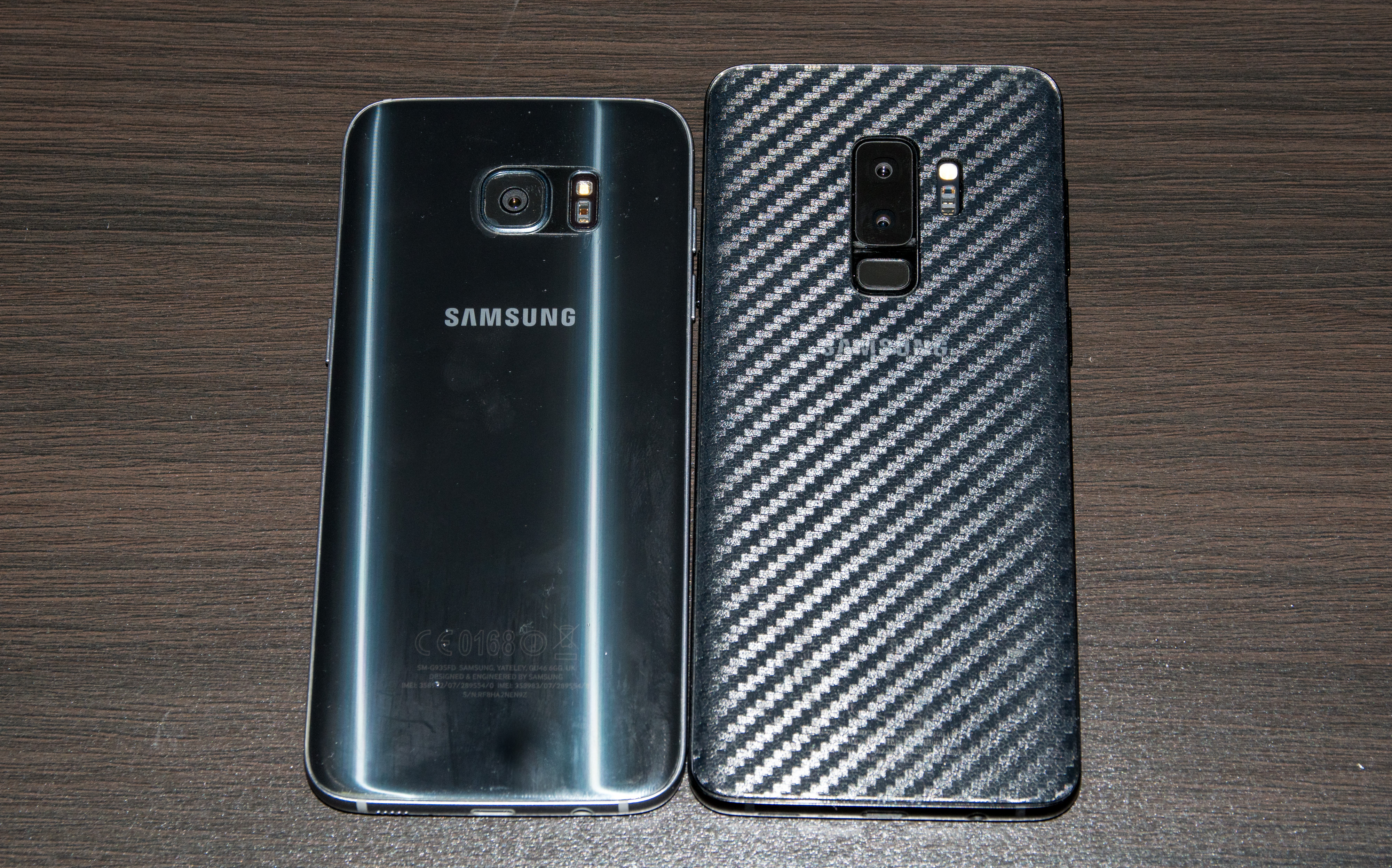
Compared to the S7 edge, the S9+ is slightly longer and negligibly thicker and wider.
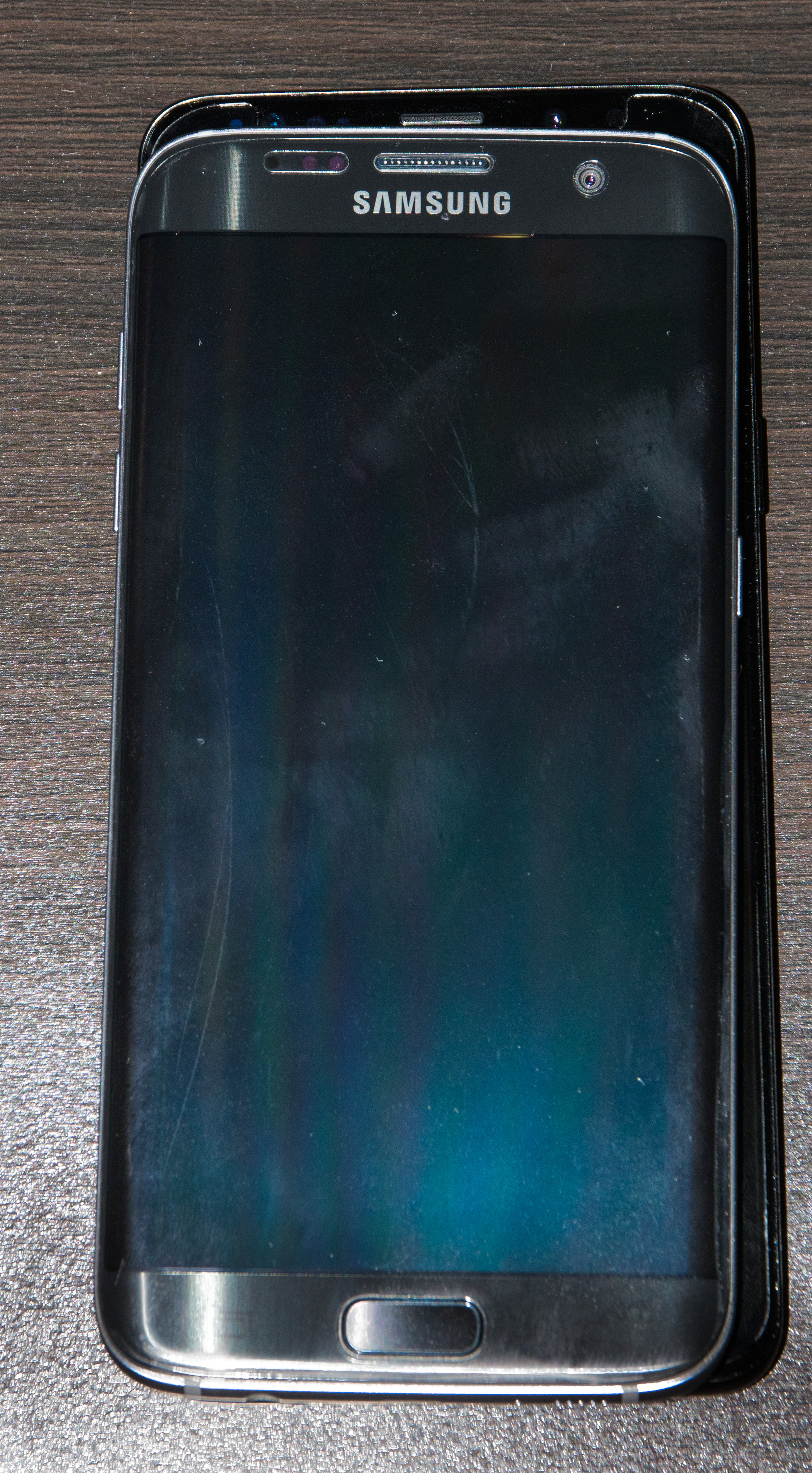
The main difference is that what used to be bezels are now screen. The consequence of this is that one-handed use is especially difficult. It doesn’t help that the S9+ is rather top-heavy. If you have smaller hands and are insistent on one-handed use, there’s a one-handed mode that is accessible either by triple tapping the virtual home button or swiping in from the bottom left/ right corner. Otherwise, opt for the regular S9 instead or grab some accessories that allow you to get a better grip on your phone (more on that later).
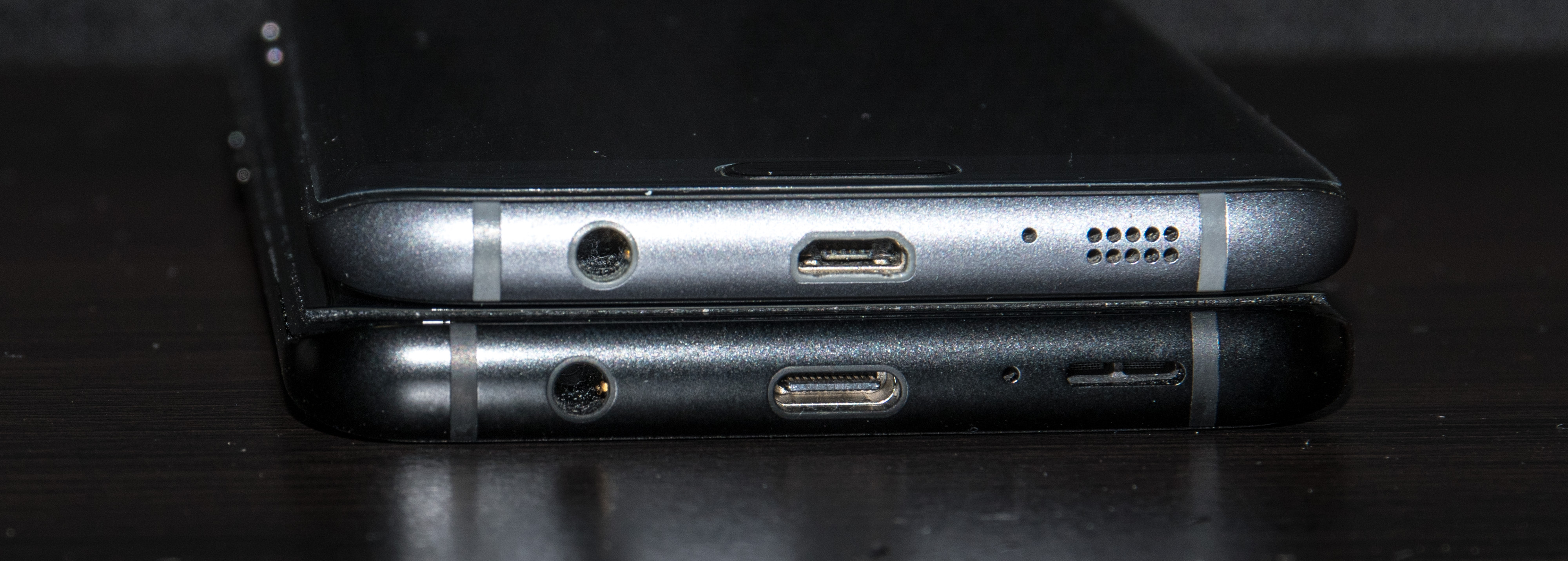
The speaker grille on the S7/S8 has now transformed into a elongated slit. The 3.5mm headphone jack is thankfully still there, as is the USB Type C connection that was introduced in the S8+.
Unboxing and Specs
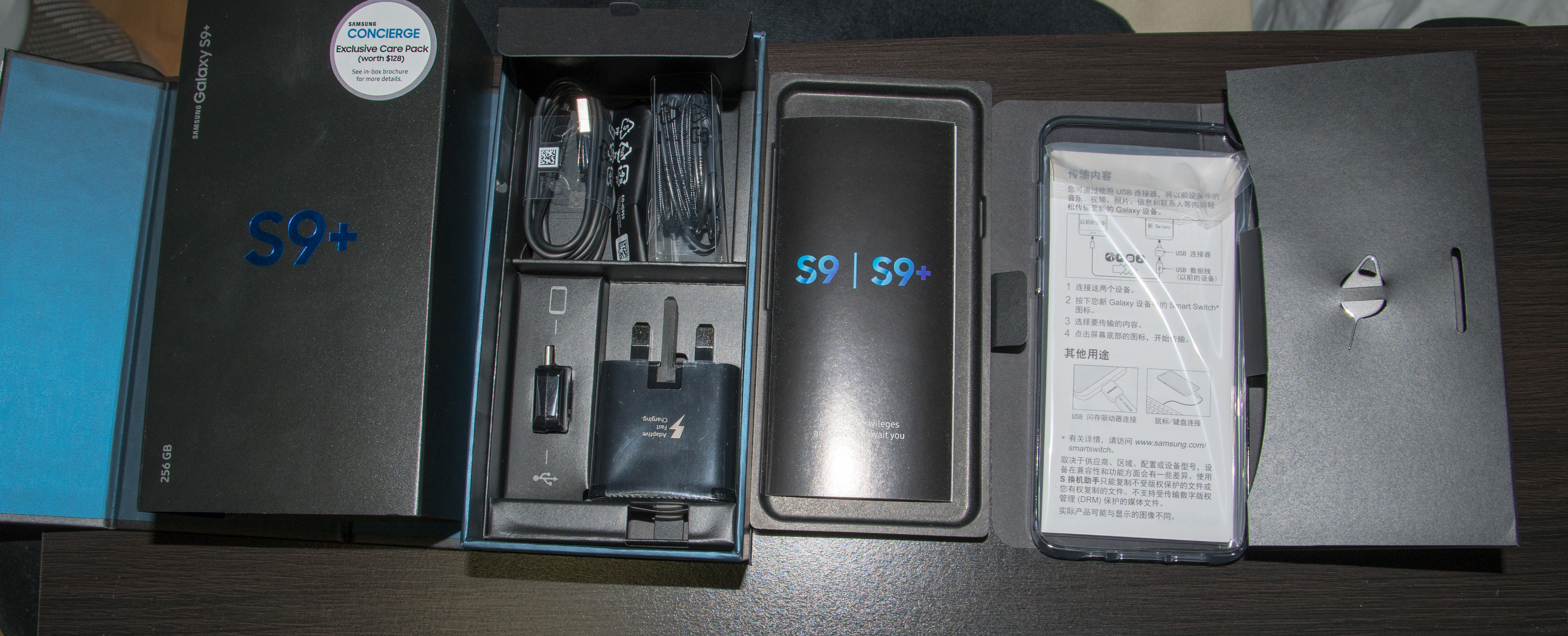
The S9+ comes in a rectangular box that looks unchanged to the S8+ and S7 edge before it. Concierge now comes default with every S9/S9+ sold in Singapore, which is a nice gesture on Samsung’s part.
Another surprise in the retail box is a thin silicone case, which would probably suffice until you get a proper one.
Apart from that, you get the SIM card prick, an Adaptive Fast Charger, a USB-A to USB-C adapter that facilitates the transfer of data from your old Android device (iOS devices can only migrate data via Wi-Fi), a USB-C cable and a pair of AKG earphones and eartips. What’s missing in the Singapore retail box is a microUSB to USB-C adapter, which is part of the package in certain overseas markets.
Specs-wise, the Samsung S9+ maintains the same 6.2-inch WQHD+ screen of the S8+. This time, it supports the HDR10 video standard, allowing for wider compatibility with HDR videos. The S9+ in Singapore is powered by the Exynos 9810 processor, which is competitive with the Qualcomm Snapdragon 845. Compared to the S9 and S8+, the S9+ comes with a generous 6GB of RAM (vs. 4GB) in all variants.
In Daily Use
In daily use, the S9+ feels way more responsive compared to the S7 edge. The additional 2GB RAM can be felt, with applications being flushed out of RAM less often. I’ve owned the S9+ for two weeks now and I’ve never seen Chrome being flushed out of RAM involuntarily thus far. Graphics are also fine; it runs the new PUBG Mobile at the highest settings without much of a hitch. 4K HDR videos lag a little on the stock Samsung Video Library player but works well on MX Player.
The S9+ runs Android Oreo 8.0 out-of-the-box. There already is a newer version out already (8.1), but it seems that Samsung has no plan to update their phones to 8.1. As usual, Samsung Experience (formerly TouchWiz) sits atop Oreo and moulds Oreo to their own design language. To me, given that I have not used stock Android before in its current form, I am perfectly happy with Samsung’s take on Android. Split-screen multitasking works much better than before, with one now able to select which part of the user interface they wish to dock. In addition, you now get a picture-in-picture mode for certain applications like YouTube, courtesy of Oreo.
If you’re planning to get the S9+, I would suggest opting for the 256GB version. While 64GB seems like a lot of space today especially with an expandable storage option, note that applications are installed to internal storage by default, and 4K videos and burst shots can only be recorded to internal storage. With the S9+ able to record 4K videos at 60fps and with many games coming in at 1-2GB each, you’ll be running out of space pretty soon on the 64GB variant.
Sadly, battery life leaves much to be desired. With the screen on and surfing on the Chrome browser, battery drains at approximately 20% per hour. On a typical day that begins at 7.30am, I find myself reaching for the charger by 4.30 in the afternoon. A typical journey on the MRT on my way to work would usually drain battery by about 15%.
On the other hand, the phone charges up pretty quickly, in about an hour and fifteen minutes. Granted, this is not as fast as certain other Qualcomm-powered smartphones, but is probably understandable given Samsung’s recent history with exploding batteries. Fast wireless charging is also supported, though you only get fast charging speeds when your phone’s battery is under a certain temperature (easily exceeded in Singapore’s hot and humid climate).
Display
As usual, the S9+ comes preloaded with four different screen profiles–Adaptive Display, AMOLED Cinema, AMOLED Photo and Basic. The latter three conform to the DCI-P3, Adobe RGB and sRGB standard respectively and the colours are apparently calibrated at the factory. I stick with Basic mode most of the time; it renders typical web content most accurately.
The S9+ utilises a Super AMOLED display, which means you get rich, deep blacks, though at the expense of possible screen burn-in (I’ve already seen some display Note8 units in stores exhibiting this problem barely eight months in), screen colour unevenness and ‘black crushing’.
To mitigate screen burn-in, I’ve decided to turn off Always On Display as a precaution. However, I’m pretty sure that in due time, the status bar and the bottom bar will burn in on my phone. Already, on my S7 edge which is barely eighteen months old, the status bar is already burnt in.
On the positive side, I do not notice any screen colour unevenness on the S9+. This was a big problem for me previously on my old Galaxy S6, where I went through five different sets and still could not find one with even colours. Symptoms of colour unevenness would be that part of the screen would have a greenish tint, whereas the other part would have a slight reddish-pink tint. Under dark conditions, when displaying a solid grey background, you would also note that certain parts of the screen are brighter than others. Thankfully, my S7 edge and S9+ seem to be free from this phenomenon.
However, the S9+ has an issue with colour banding on dark gradients, which is symptomatic of the ‘black crush’ phenomenon, where dark grey colours are rendered as black instead. Ironically, the default wallpapers on the S9+ showcases this issue pretty well.
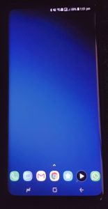
Curiously, according to user reports, only the S9+ suffers from this issue, whereas the S9 remains unaffected. Perhaps, and hopefully, this is a screen calibration issue that can be mitigated by software. For what it’s worth, I checked out display S9+ units at various Samsung stores and was unable to replicate the same issue.
The real-life implication of this issue is when you watch movies in low-light. Apparently, detail will be lost in areas rendered in dark grey. There are already a few discussions about this issue over at Android Central and XDA Developers. I suspect, though, one might have to be pretty discerning to tell if there’s an issue. Thus far, I have not had any issues with display quality when viewing videos in the dark.
On the other hand, in bright sunlight, the S9+ excels. Where my S7 edge would struggle to render dark areas in videos under bright sunlight, the S9+ works just fine. HDR videos, too, are a treat to watch, though there’s currently a bug in YouTube’s implementation that causes flickering when viewing HDR videos in the dark.
Camera
The greatest selling point of the S9+ is the new dual aperture F1.5/2.4 rear camera coupled with a new F2.4 telephoto camera. The 12MP main camera now shoots 4K video at up to 60fps, and snaps 1080p slow motion videos (which needs to be enabled in camera settings) at 480fps and a new 960fps ultra slow motion mode at 720p.
Dual Aperture
I have read several reviews of the S9 and most of them do not accurately explain the dual aperture feature.
A camera’s aperture determines the amount of light that is let in by the camera lens. A wider aperture (i.e. F1.5 as compared to F2.4), all things being equal, allows more photons to hit the sensor, resulting in lower noise photos. However, each photosite on a camera’s sensor can only record a certain number of photons, at which point the ‘full well capacity’ is reached. Thereafter, any extraneous photons hitting the photosite would be discarded. On the S9+, at F1.5, the number of photons hitting the sensor is greater than that at F2.4. Accordingly, to achieve the same exposure in F1.5 mode as with F2.4, the shutter speed must be halved.
In addition, a wider aperture results in a shallower depth of field, where less of the image can be in focus at any one point in time. Depth of field is a function of absolute aperture size, which in turn is a function of relative aperture size and sensor size. This depth of field effect is what DSLRs and mirrorless cameras with large sensors are renowned for, which forms the basis of Apple’s “Portrait Mode” simulation and Samsung’s “Live Focus” equivalent. In laymen terms, a shallower depth of field means that the background gets blurrier more quickly. However, this is only apparent when your absolute aperture size gets larger, such as when you use a full-frame DSLR or mirrorless camera. As the sensor size of the S9+’s camera is very small (about 38 times smaller than a full-frame camera), the increase in depth of field when using a F2.4 aperture vs F1.5 is barely noticeable, as you can see from the example below (focus was set on the tip in both cases):


With this in mind, the only main advantage arising from the dual aperture camera that I can think of is where you want to show motion in medium-light situations. One such situation is in the case of the Star Flyer at the ongoing Prudential Marina Bay Carnival, where you want to show the Star Flyer in motion:

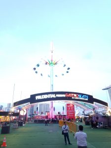
To show motion, you would need a slower shutter speed, which in this case I chose 1/10s. At F1.5, the resulting image was over-exposed due to the amount of light coming in. At F2.4, the amount of light coming in was moderated, such that the image was well exposed.
Daylight Shots

The S9+ performs well in the day, as to be expected from any modern smartphone camera. In Pro mode, the S9+ is able to vary shutter speed from 1/24000s to 10s, which should be adequate in almost all situations. Aperture size defaults to F2.4 when lighting is adequate.
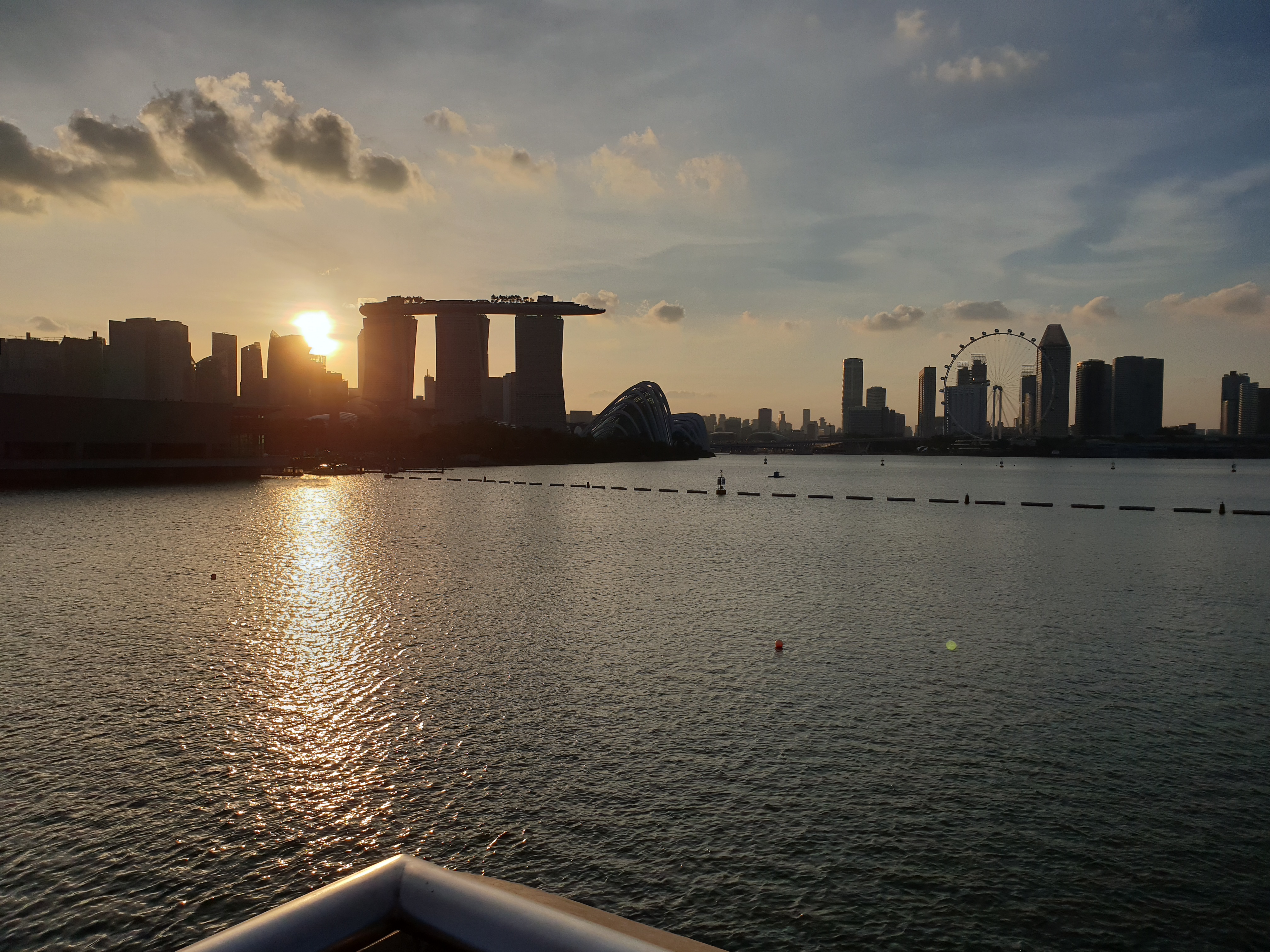
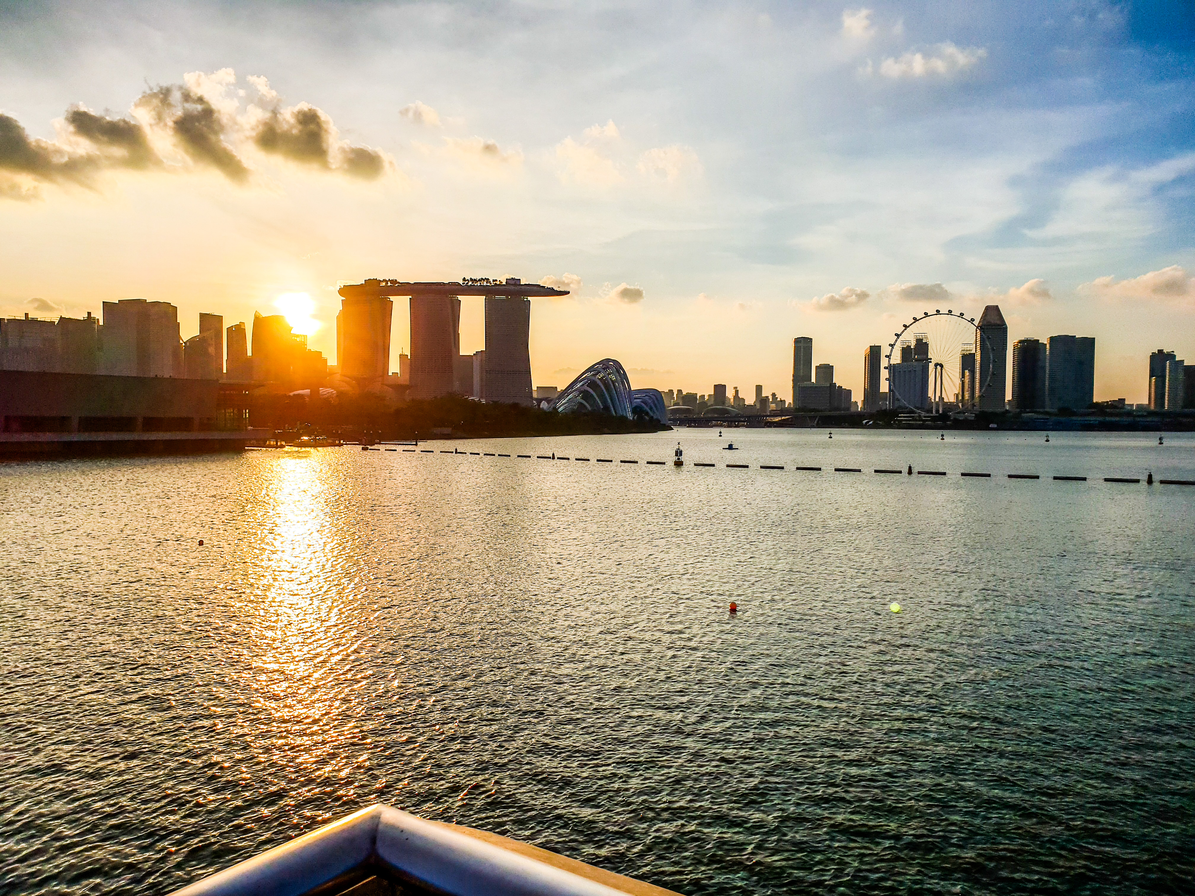
One of the toughest shots in daylight photography is where you want to capture both the sunrise/ sunset and the foreground at the same time. Straight out of camera, the S9+ didn’t fare too well in this regard, even with HDR set to auto (note: exposure bias was set to -1.4 stops in this case; setting it to zero led to an overexposed image). However, with some Photoshop magic, you can recover most of the detail, even within a JPEG file. For better results, though, switch to RAW.
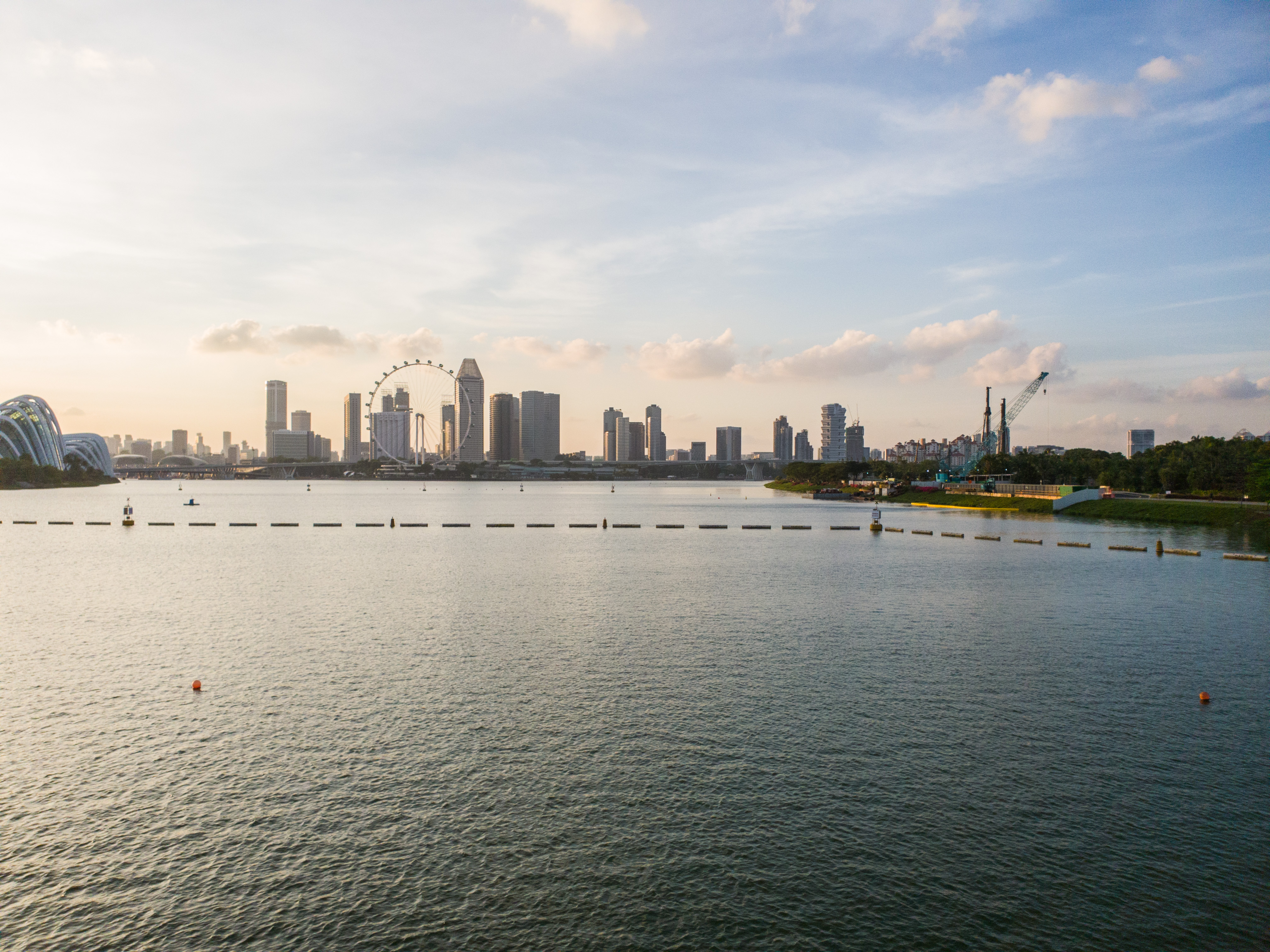
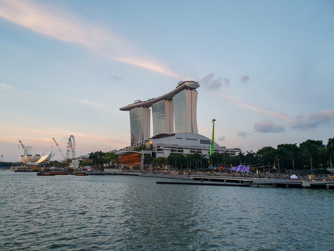
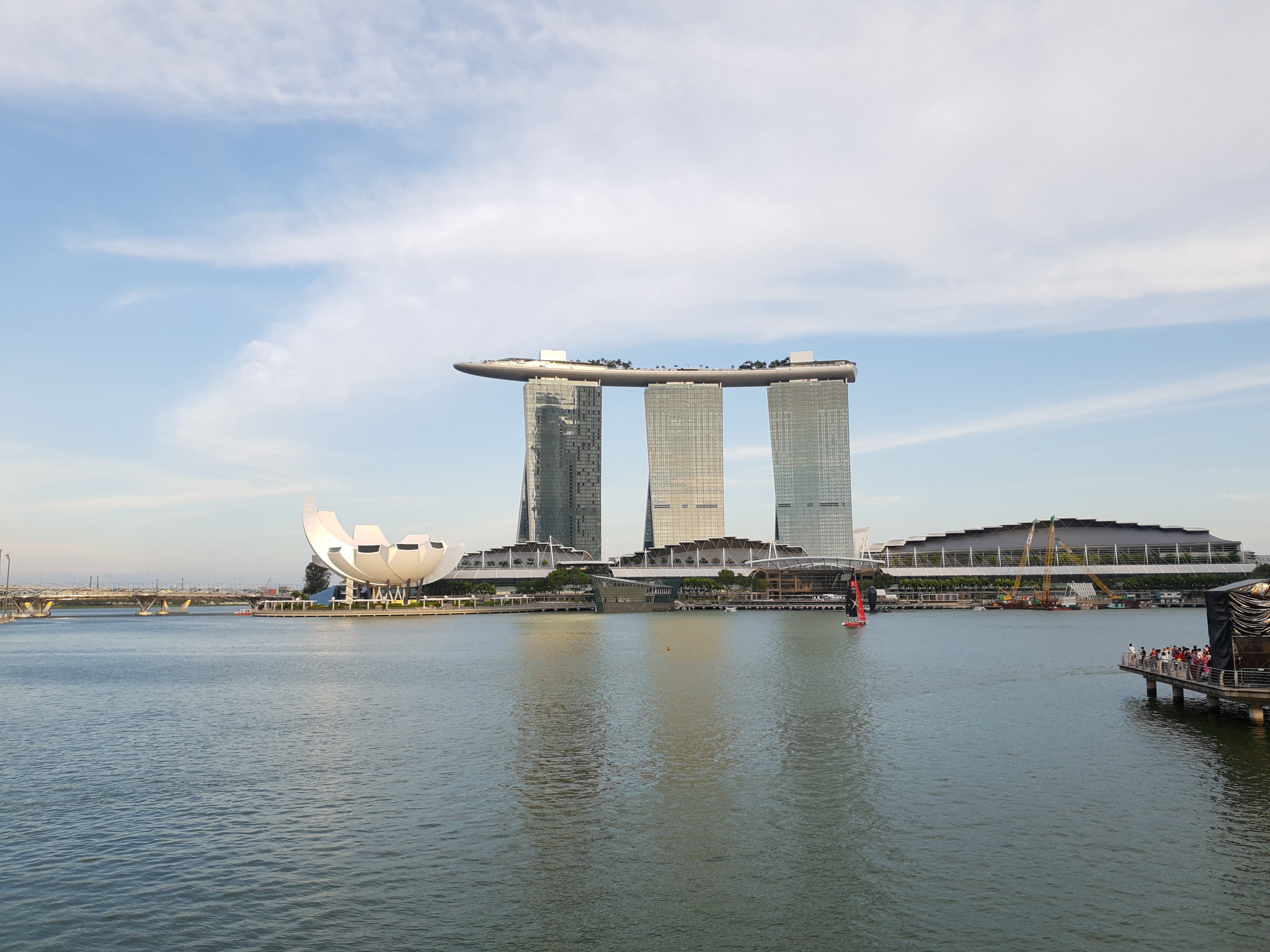
Here are some other shots taken in daylight, with some shots post-processed from RAW:
Telephoto Camera
The telephoto camera on the S9+ is regretfully rather simplistic. It is only available in Auto mode, and only works in good lighting. In poorer lighting (or if you cover the telephoto lens for a few seconds), the camera will automatically switch back to the main camera and use digital zoom, such as in this case:
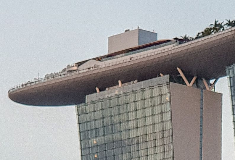
Meanwhile, when the camera decides to use the telephoto camera, shots come out pretty decently:
Low Light


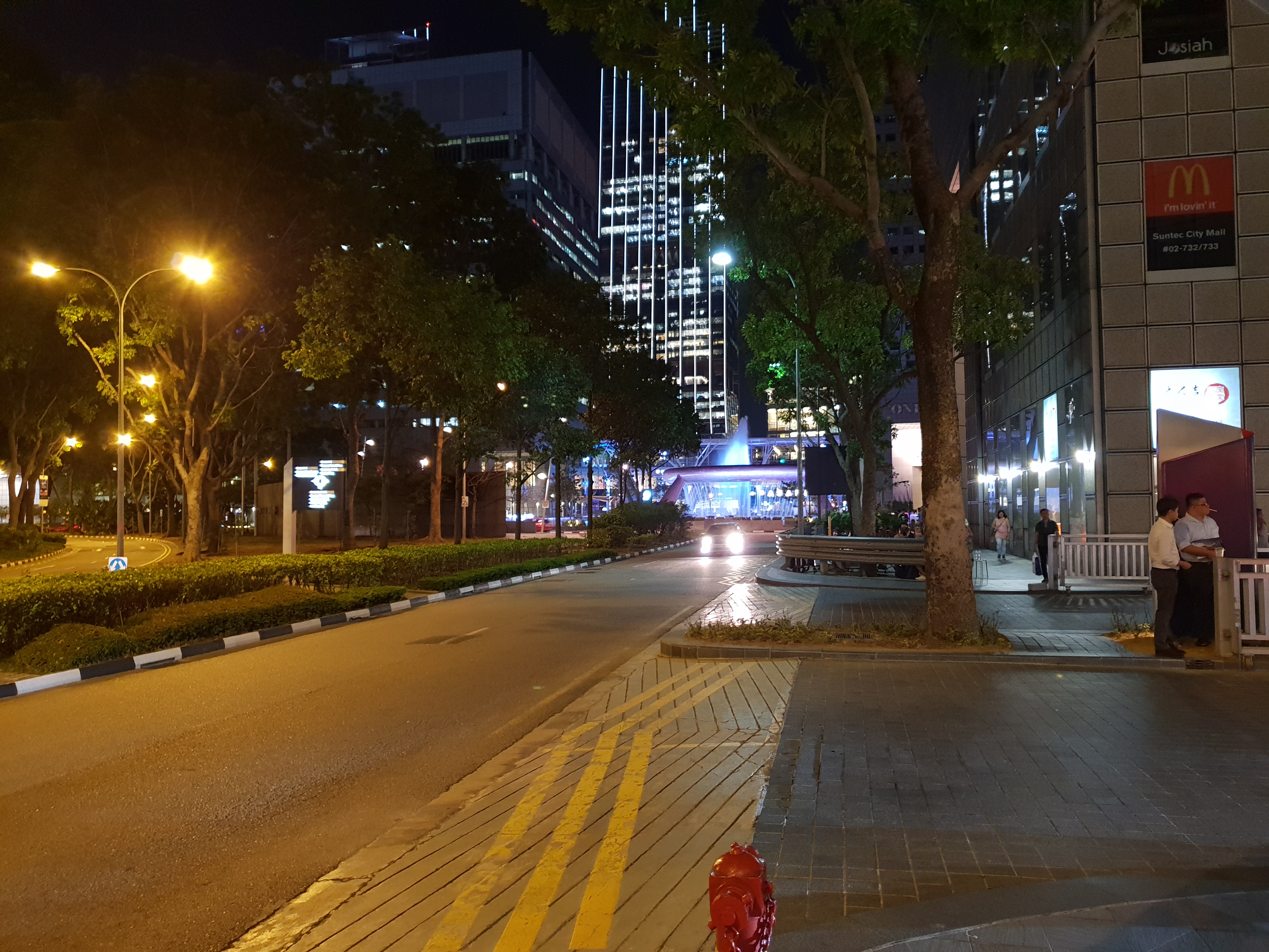
In low light, the Galaxy S9+ performs slightly better than the older S7 edge, in part due to the multi-frame noise reduction technique adopted by the S9+. In some situations, noise reduction can get a little too aggressive though, leading to a slight loss of detail.
Live Focus
Live focus is a mixed bag. It works well in the following case:
But not too well in others:
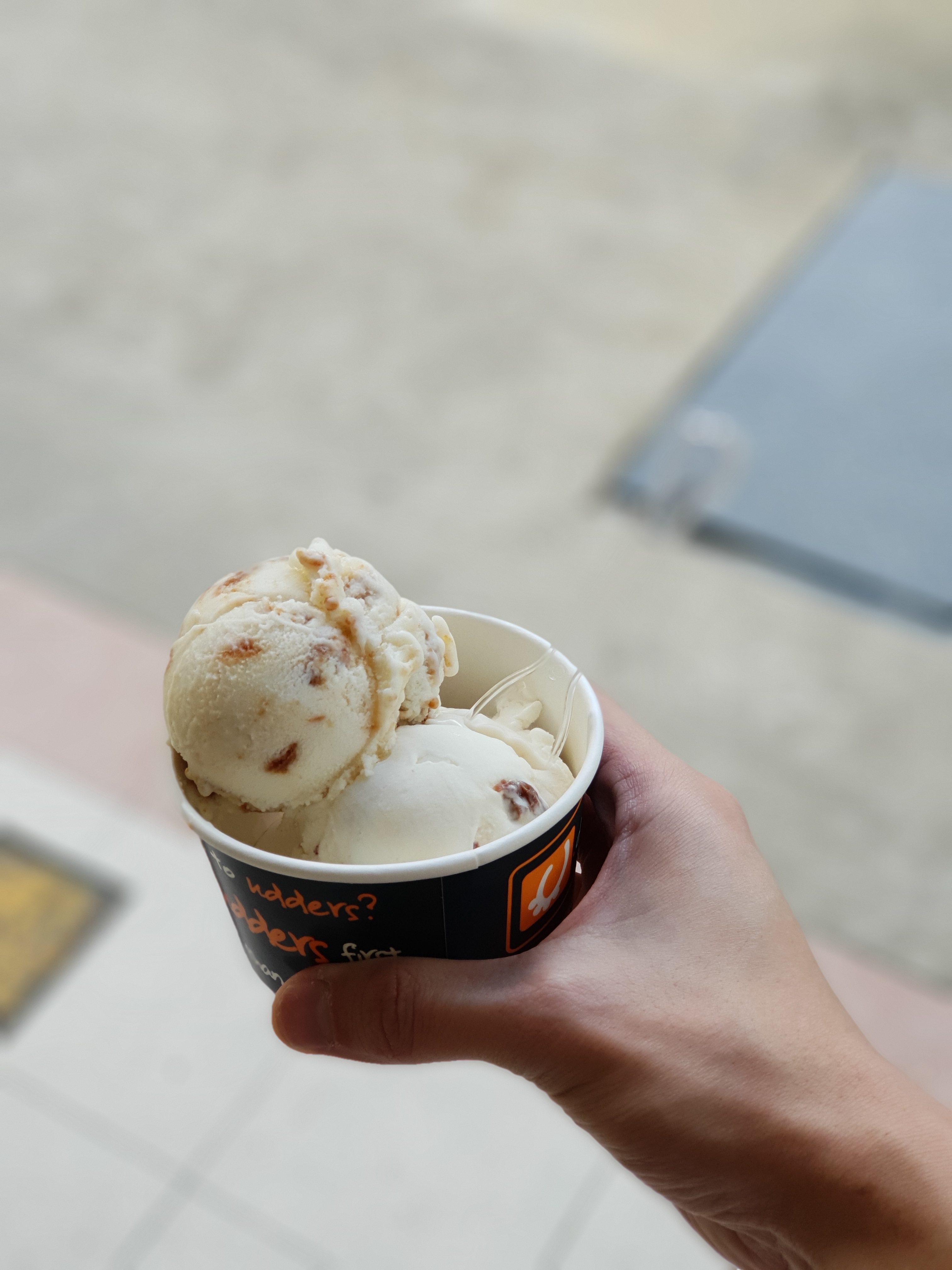
Live focus images are also larger in filesize because they store both the wide angle and telephoto shoots in one JPEG.
Ultra Slow Motion Videos
Ultra slow motion videos at 960fps are best done in daylight. In low light and in the presence of fluorescent lighting (such as above), you get a significant amount of flickering and a very dark video. This is perhaps not too surprising since each frame is essentially exposed to light for only 1/960th of a second.
That said, the user interface for ultra slow motion videos is very intuitive. There is a detection box in the camera’s viewfinder which you can move around or resize. Once you press the record button, the phone automatically slows down the video when it detects motion within the said box. You can record a couple such ultra slow motion videos within a single clip itself. Very nifty.
AR Emoji
Lastly, we also get Samsung’s take of Apple’s Animoji feature which was a novelty feature in last year’s iPhone X. Samsung’s version is perhaps a tad too creepy, with the default AR Emojis being a caricature of your own face. Like Apple’s version, AR Emoji doesn’t depict tongue movement, making such life-like caricatures a tad unnatural.
Thankfully, on actual launch day, Samsung and Disney partnered up to release AR Emoji versions of Mickey and Minnie Mouse. These look much better.
Conclusion
At $1,498 without contract (street price about $1,300), the entry price of the S9+ 256GB is admittedly steep. However, it offers all the things one could ask for in a flagship (perhaps except for 3D Touch which most iPhone users barely use anyway anyway) and has kept important features intact, like the 3.5mm headphone jack, microSD card slot and dual SIM support. If you’re looking to upgrade from a phone from 2016 or earlier, the S9+ (or the S9) is an easy choice. If you’re coming from the S8/S8+, perhaps it’s wiser to wait for another generation.
Accessories
The S9+ comes with Samsung’s trademark edge screen, which means most tempered glass screen protectors will typically not work well due to reduced touch sensitivity. However, the S9+ has in place a new increased touch sensitivity mode, to cater to such glass screen protectors.
There is one tempered glass screen protector on the market that does not suffer from such touch sensitivity issues (even with increased touch sensitivity turned off): the Whitestone Dome. The trick is that it uses a special kind of transparent adhesive over the phone’s screen, on which the screen protector is pasted over. The application process is somewhat tricky, requiring the use of a UV light, but the Whitestone Dome package comes with the required tools and guides to make installation as fuss-free as possible. It can be purchased from Qoo10 from $30 to $60, depending on promotion. A couple of mobile phone shops will also install the Whitestone Dome for you at an added charge. Such shops include CaseFactorie and Red White Mobile in Bugis.
Only certain cases are compatible with the Whitestone Dome. These include, from experience, the Spigen Tough Armor, UAG Monarch, and ITSKINS Spectrum. From other users’ reviews, the Ringke Fusion, VRS Crystal Bumper and Samsung’s official Protective Cover works fine as well. I have verified that Spigen’s Slim Armor and Liquid Crystal doesn’t work well with Whitestone Dome.
The S9+ supports fast cabled charging through any compatible Qualcomm QuickCharge 2.o/3.0 chargers. However, with the new Samsung Wireless Fast Charging Stand, you have to use an official Samsung charger to get fast wireless charging. Third party wireless pads, though, seem to work fine with a third party QC2.0/3.0 charger for fast wireless charging. Do note that the phone gets pretty hot when charging, at which point it may switch back to slow wireless charging, especially on third party pads which do not come equipped with a small fan.
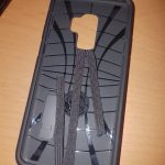
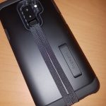
If you’re afraid of dropping your phone, consider sticking a mobile phone grip behind your case. World Wide Computer Services at Sim Lim Square sells the SlingGrip (or a copy thereof?) for just a dollar each. Alternatively, if you have a bulkier case, fashion your own Ninja Loop using an elastic band (use double-sided tape for a more secure fit):

